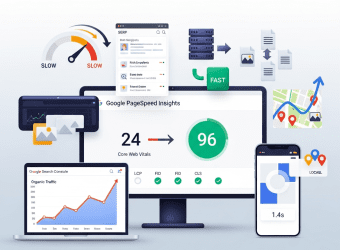
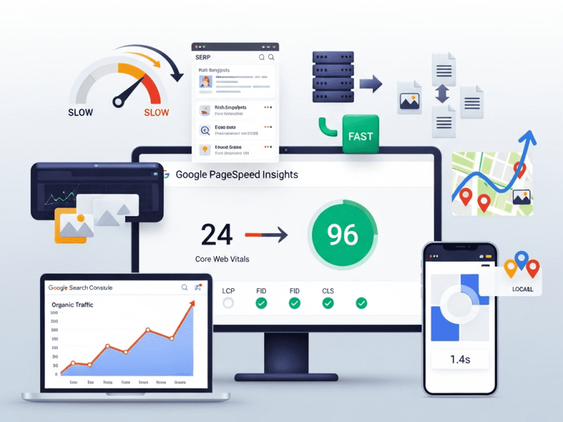
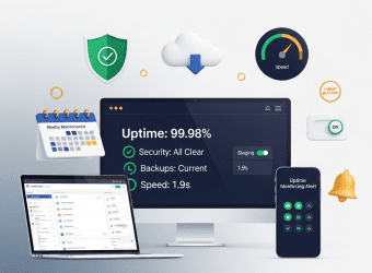
We performed a complete speed and SEO optimization for Northwell Partners — taking page load time from 7.2s to 1.4s, lifting Google PageSpeed from 24 to 96 (mobile), growing organic traffic 284%, achieving 42 first-page keyword rankings from zero, and transforming a slow, invisible WordPress site into a fast, high-ranking client acquisition machine.
Comprehensive Speed Audit & Optimization, Core Web Vitals Remediation, Server & Hosting Optimization, Image & Asset Optimization Pipeline, Database & Code Cleanup, Technical SEO Audit & Implementation, On-Page SEO Optimization, Schema Markup Implementation, Internal Linking Architecture, Content SEO Strategy, Local SEO (Multi-Office), SEO Monitoring & Reporting System
Tools & Platforms Used
Google PageSpeed Insights, GTmetrix, WebPageTest, Chrome DevTools (Lighthouse), Google Search Console, Google Analytics 4, Screaming Frog SEO Spider, Semrush, Ahrefs, Yoast SEO Premium, WP Rocket, ShortPixel, Cloudflare Pro, Perfmatters, Query Monitor, Asset CleanUp Pro, JEBI (Schema), WP-Optimize, Redis Object Cache, Imagify, Google Tag Manager, Google Business Profile, Notion, Slack, Loom
Project Year
2025
The Overview
Northwell Partners is a global financial advisory firm with 62 advisors across offices in Boston, London, and Toronto. They provide wealth management, retirement planning, corporate advisory, and estate planning services to high-net-worth individuals and mid-market enterprises. Assets under management: $4.2B. Annual revenue: $38M. Their client base includes C-suite executives, business owners, and multi-generational family offices.
Their WordPress website — redesigned 18 months ago by a premium agency for $85,000 — looked beautiful. Full-screen hero videos, parallax scrolling, animated counters, custom icon sets, interactive service diagrams, and a sophisticated advisor directory. The design won an Awwwards Honorable Mention.
There was just one problem: it was practically unusable.
The homepage took 7.2 seconds to load. On mobile (54% of traffic), it was worse — 9.8 seconds. Google PageSpeed scored it 24/100 (mobile) and 41/100 (desktop). All three Core Web Vitals were “Poor.” The hero video alone was 18MB. The page loaded 4.2MB of JavaScript — more than most entire websites. Every page had 142 HTTP requests. The beautiful animated counters used a JavaScript library that was 380KB. For counting to 4.
And the SEO? The $85,000 agency had apparently never heard of it. No meta descriptions on 67 of 84 pages. No schema markup. No XML sitemap optimization. A robots.txt file that accidentally blocked Google from crawling the advisor directory (their most important section). H1 tags used for styling rather than content hierarchy — the homepage had 7 H1 tags. Internal linking was random. Image alt text was either missing or auto-generated (“IMG_4872.jpg”). The site ranked for exactly 12 keywords — all branded (the firm’s name).
For a financial advisory firm where trust and credibility are everything, a slow website signals the opposite: “We don’t have our act together.” And for a firm spending $180K/year on Google Ads driving traffic to pages that took 7+ seconds to load, speed wasn’t just a user experience issue — it was burning money. Google’s own data shows 53% of mobile visitors leave if a page takes more than 3 seconds to load. Northwell was losing more than half their visitors before the page even appeared.
We performed a complete speed and SEO optimization — from server-level performance overhaul and asset optimization to technical SEO remediation, on-page optimization, schema markup, internal linking architecture, and local SEO for three offices — transforming their slow, invisible website into a fast, high-ranking client acquisition machine.
The Challenge
Speed Performance (Before):
Metric
Homepage
Advisor Directory
Service Pages
Target
Page Load Time
7.2 seconds
6.8 seconds
5.4 seconds
< 2.0 seconds
Google PageSpeed (Mobile)
24/100
28/100
32/100
90+
Google PageSpeed (Desktop)
41/100
44/100
48/100
95+
Largest Contentful Paint (LCP)
6.4 seconds (Poor)
5.8 seconds (Poor)
4.2 seconds (Poor)
< 2.5 seconds
First Input Delay (FID/INP)
380ms (Poor)
320ms (Poor)
280ms (Poor)
< 200ms
Cumulative Layout Shift (CLS)
0.42 (Poor)
0.28 (Poor)
0.18 (Poor)
< 0.1
Total Page Size
12.4 MB
8.6 MB
6.2 MB
< 2.0 MB
HTTP Requests
142
118
96
< 40
JavaScript Size
4.2 MB
3.8 MB
2.9 MB
< 500 KB
Time to First Byte (TTFB)
1.8 seconds
1.6 seconds
1.4 seconds
< 0.4 seconds
Root Causes Identified:
Problem
Size/Impact
Cause
Hero video (unoptimized)
18MB MP4, auto-playing on all devices including mobile
Agency used raw camera footage, no compression, no mobile fallback
JavaScript bloat
4.2MB across 28 JS files, 18 render-blocking
Animation libraries (GSAP, ScrollMagic, Anime.js, CountUp.js, Particles.js) — most used for one small element each
CSS bloat
1.8MB across 12 CSS files
Elementor’s generated CSS + theme CSS + 6 plugin CSS files, 82% unused on any given page
Unoptimized images
68 images averaging 1.2MB each (should be ~100KB)
Full-resolution photos uploaded without compression, no WebP, no responsive srcset
No caching
Every visit regenerated the page from scratch
No page caching, no browser caching, no CDN configured
Shared hosting
TTFB: 1.8 seconds
Budget shared hosting ($12/month) for an $85,000 website — server shared with 200+ other sites
Google Fonts (external)
4 font families, 12 weights, loaded from Google API
Render-blocking external requests, loading fonts never used on the page
No lazy loading
All 68 images + 3 videos loaded immediately on page load
Below-fold content loading before visitor scrolls to it
Unused plugins loading assets globally
8 plugins loading CSS/JS on every page even when not used on that page
Contact Form 7 loading on pages with no forms, Slider Revolution loading on pages with no sliders
SEO Performance (Before):
Metric
Current
Where It Should Be
Gap
Keywords Ranking (Page 1)
12 (all branded)
50-80+ (branded + service + location)
No non-branded visibility
Monthly Organic Traffic
2,800 visitors
10,000-15,000 (for a firm this size with this content)
72-81% below potential
Organic Traffic as % of Total
18%
40-55%
Over-reliant on paid traffic
Monthly Google Ads Spend
$15,000
Could reduce significantly with organic ranking
Paying for traffic that should be free
Pages with Meta Descriptions
17 of 84 (20%)
100%
67 pages with auto-generated or missing snippets
Pages with Optimized H1
8 of 84 (10%)
100%
7 H1 tags on homepage alone
Schema Markup
None
Organization, LocalBusiness, Person, FAQPage, BreadcrumbList, Service
Zero structured data for search engines
Internal Links (Avg per Page)
2.4
8-12
Weak internal linking = poor page authority distribution
Image Alt Text Coverage
24%
100%
76% of images invisible to search + accessibility failure
font-display: swap — text visible immediately in fallback font, swaps to custom font when loaded
No invisible text, no layout shift from font loading
Subset
Full Unicode range for all fonts
Latin subset only (covers EN/FR/DE)
40-60% smaller font files
JavaScript & CSS Cleanup:
Action
Tool
Impact
Per-page asset loading
Perfmatters + Asset CleanUp Pro: disable plugins’ CSS/JS on pages where they’re not used
Contact Form 7 CSS/JS removed from 78 pages that have no forms. Slider Revolution removed from 80 pages with no slider. WooCommerce assets removed from non-shop pages.
Animation library consolidation
Replaced 5 separate animation libraries (380KB+ combined) with CSS animations + minimal vanilla JS (12KB total)
The counter that counted to 4 no longer needs a 380KB library
Third-party script delay
WP Rocket delay JS: Google Analytics, Facebook Pixel, Google Tag Manager, Hotjar, Intercom chat — all delayed until user interaction (scroll, click, touch)
These scripts load AFTER the page is interactive — zero impact on initial load
jQuery migration removal
Removed jQuery Migrate (deprecated, only needed for legacy plugins)
30KB less JS
Inline critical CSS
WP Rocket auto-generates critical CSS per page template
HOMEPAGE ├── Links to all 6 service pages (primary nav + content links) ├── Links to 4 pillar content guides ├── Links to featured advisors (rotating) └── Links to latest blog posts
SERVICE PAGES (6) ├── Links to related advisors (who specialize in this service) ├── Links to relevant blog posts / case studies ├── Links to FAQ section (same page) ├── Links to contact/consultation page └── Cross-links to related service pages
ADVISOR PROFILES (62) ├── Links to their practice areas (service pages) ├── Links to articles they've authored (blog) ├── Links to office location page └── Links to consultation booking
PILLAR CONTENT (4 Guides) ├── Links to relevant service pages (commercial intent) ├── Links to advisors who specialize in topic ├── Links to related blog posts (supporting content) └── Links to contact/consultation
BLOG POSTS (34 existing + ongoing) ├── Links to parent pillar content ├── Links to relevant service pages ├── Links to advisors mentioned └── Cross-links to related posts
RESULT: Every page links to 8-12 other relevant pages. Topic clusters form around service areas with pillar content at the center. Authority flows throughout the site. ━━━━━━━━━━━━━━━━━━━━━━━━━━━━━━━━━━━━━━━━━━━━━━━━━━━━━━━
Phase 5: Local SEO, Monitoring & Reporting (Week 5)
Local SEO (3 Offices):
Element
Implementation (Per Office)
Google Business Profile
Claimed, verified, and fully optimized: business name, category (Financial Planner), address, phone, hours, website (linked to office-specific landing page), description (250 words, keyword-rich), services listed, photos (exterior, interior, team — 15+ per office), Q&A pre-populated with common questions
Office Landing Pages
Dedicated page per office: /locations/boston/, /locations/london/, /locations/toronto/ — with unique content (not duplicated), local team profiles, driving directions, embedded Google Map, local testimonials, and LocalBusiness schema
NAP Consistency
Name, Address, Phone verified as identical across: website, Google Business Profile, LinkedIn, Yelp, industry directories, and legal registries
Local Citations
30+ quality citations per office: financial industry directories, local business directories, chamber of commerce listings
Review Strategy
Template request emails for Google reviews post-client engagement, review response protocol (respond to all within 48 hours)
Local Content
Blog posts with local relevance: “Wealth Management in Boston: What High-Net-Worth Individuals Should Know,” “London Financial Advisory Landscape 2025,” “Toronto Estate Planning Guide”
SEO Monitoring System:
What We Monitor
Tool
Frequency
Alert Trigger
Keyword Rankings
Semrush (42 target keywords tracked)
Weekly
Any keyword drops 5+ positions
Organic Traffic
Google Analytics 4
Weekly
Traffic drops 15%+ week-over-week
Core Web Vitals
Google Search Console + PageSpeed (automated)
Weekly
Any metric moves from “Good” to “Needs Improvement”
Crawl Errors
Google Search Console
Weekly
Any new crawl errors appear
Indexation
Google Search Console (“Pages” report)
Bi-weekly
Pages dropping from index or “Excluded” with unexpected reason
Backlink Profile
Ahrefs
Monthly
Toxic links detected, significant link gains/losses
Total organic sessions, trend vs. previous month and year-over-year, top landing pages from organic, new vs. returning
Keyword Rankings
Current position for all 42 tracked keywords, changes from last month, new keywords ranking, keywords approaching Page 1
Core Web Vitals
LCP, INP, CLS — all green? Any degradation? Speed benchmarks for key pages
Content Performance
Top 10 organic landing pages by traffic, top blog posts, pages needing content refresh
Local SEO
GBP insights: views, clicks, calls, directions per office. Local keyword rankings. Review count and rating.
Technical Health
Crawl errors, indexation status, any new issues detected
Recommendations
Next month priorities: new content to create, pages to optimize, technical improvements, opportunities identified
Handover Documentation:
Document
Purpose
Speed Optimization Record
Complete documentation of every optimization performed: before/after metrics, settings, configurations, tools
SEO Strategy Document
Keyword strategy, content plan, internal linking architecture, local SEO plan — living document updated quarterly
Schema Markup Reference
All schema implemented with code snippets, where applied, and how to add schema to new pages
Content SEO Checklist
For every new page/post: SEO title format, meta description template, H1 rules, alt text guidelines, internal linking minimum, schema requirements
Speed Maintenance Guide
How to maintain speed: image upload procedures, plugin installation rules, what not to do (no unoptimized videos, no new JS libraries without approval)
Monthly Report Template
Pre-formatted report structure with data sources and interpretation guide
Tool Access & Configuration
All tool logins, API keys, Search Console/Analytics access, monitoring configurations
Key Features Delivered
Feature
Description
Server Migration
Shared hosting ($12/mo) → Managed WordPress hosting with NVMe SSD, PHP 8.2, LiteSpeed — reducing TTFB from 1.8s to 0.28s
CDN & Edge Optimization
Cloudflare Pro: global CDN, edge image optimization, Brotli compression, HTTP/3, Early Hints, bot management
WordPress Caching System
WP Rocket: page caching, browser caching, critical CSS, JS defer/delay, database cleanup, DNS prefetch — fully configured and tested
Image Optimization Pipeline
842 images compressed (91% reduction), WebP conversion, responsive srcset, lazy loading — plus automated pipeline for future uploads
Video Optimization
36MB → 4.8MB total video payload, mobile poster images, lazy loading, Cloudflare Stream hosting
$8,500/month (reduced as organic captures paid keywords)
⬇ 43%
Estimated Monthly Value of Organic Traffic
~$4,200
$18,600 (based on equivalent CPC)
⬆ 343%
Advisor Profile Page Views
840/month
4,200/month (no longer blocked from Google)
⬆ 400%
Local Pack Appearances (3 Offices)
0
3 offices appearing in local pack for key service + location queries
—
Google Business Profile Views (Monthly, All 3)
1,200 (unoptimized)
8,400
⬆ 600%
GBP-Driven Calls (Monthly)
18
62
⬆ 244%
Blog Post Traffic (Monthly)
680 (thin content, no SEO)
3,400 (optimized + pillar content)
⬆ 400%
Consultation Requests (Organic Traffic)
8/month
34/month
⬆ 325%
New Client Revenue Attributed to Organic
~$120K/year (estimated)
$680K/year (estimated from organic-driven consultations)
⬆ 467%
Rich Results (Schema-Driven)
0
FAQ snippets on 4 pages + breadcrumbs on all pages + Knowledge Panel enhanced
—
📋 Case Study Summary
Challenge: Northwell Partners — a global financial advisory firm with $4.2B AUM and 62 advisors across Boston, London, and Toronto — had a beautifully designed but catastrophically slow WordPress website (7.2s load time, 24/100 PageSpeed mobile) and zero SEO visibility (12 branded keywords only, 67/84 pages missing meta descriptions, robots.txt blocking the advisor directory from Google). The $85,000 design agency delivered visual awards but no performance or SEO foundation. An 18MB hero video, 4.2MB of JavaScript, 142 HTTP requests per page, no caching, shared hosting, and no schema markup. The firm was spending $15,000/month on Google Ads driving traffic to pages where 53%+ of visitors left before the page loaded. For a wealth management firm where trust is everything, a slow website was an expensive credibility problem.
Solution: We performed a complete speed and SEO optimization — migrating to managed hosting (TTFB: 1.8s → 0.28s); deploying Cloudflare Pro CDN with edge optimization; configuring WP Rocket caching with critical CSS and deferred JS; compressing 842 images (91% reduction) with WebP and lazy loading; optimizing videos (36MB → 4.8MB); self-hosting fonts; cleaning JavaScript (4.2MB → 480KB) and CSS (1.8MB → 320KB) through per-page asset loading; fixing robots.txt, 48 crawl errors, redirect chains, and canonical tags; implementing 8 schema types across 84 pages including Person schema for 62 advisors; writing custom SEO titles and meta descriptions for all pages; adding alt text to 842 images; building internal linking architecture (2.4 → 10+ links per page); expanding 6 service pages and creating 4 pillar content guides; optimizing Google Business Profiles for 3 offices with 30+ citations each; and building a 9-point SEO monitoring system.
Result: Page load dropped from 7.2s to 1.4s. PageSpeed went from 24 to 96 (mobile). All Core Web Vitals reached “Good.” Page size shrank from 12.4MB to 1.1MB. Organic traffic grew 284% (2,800 → 10,750/month). Page 1 keywords grew from 12 to 54. Google Ads spend decreased 43% as organic captured paid keywords. Bounce rate dropped 50%. Session duration grew 226%. Advisor profile views grew 400% (directory no longer blocked from Google). Local pack appearances achieved for all 3 offices. GBP-driven calls grew 244%. Organic consultation requests grew 325%. Estimated organic-attributed new client revenue grew from $120K to $680K annually. Speed and SEO aren’t separate — together, they’re the foundation everything else stands on.
A Beautiful Website Nobody Can Find Is Just Expensive Art
We optimize WordPress speed and SEO so your website loads in under 2 seconds, ranks on Page 1 for the keywords that matter, and converts the traffic you’re already paying for — turning your website from a digital brochure into a client acquisition engine.
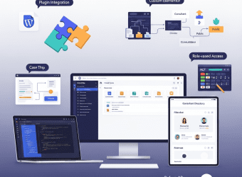
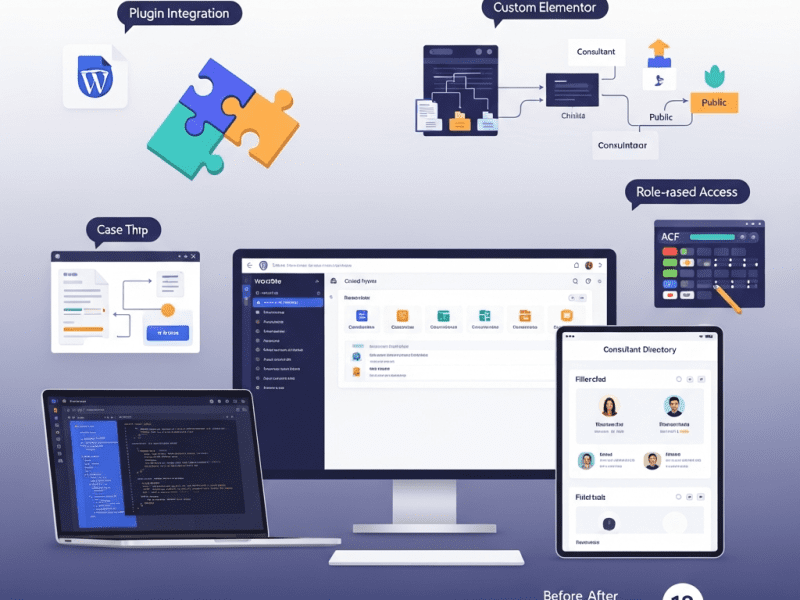
We delivered deep plugin and theme customizations for Catalyse Consulting — building 3 custom plugins, extending 6 third-party plugins, and customizing their Elementor theme to create a tailored WordPress ecosystem that eliminated $4,200/month in SaaS tool costs, automated 18 hours/week of manual workflows, and transformed a generic WordPress installation into a bespoke digital operations hub.
WordPress (self-hosted), Elementor Pro, Advanced Custom Fields (ACF) Pro, Custom PHP/CSS/JavaScript, WooCommerce, Gravity Forms, WPML (multilingual), SearchWP (custom search), User Role Editor, WP All Import Pro, GitHub (version control), VS Code (development), Local by Flywheel (local dev), ManageWP, WP Rocket, Cloudflare, Google Analytics 4, Figma, Notion, Slack, Loom
Project Year
2025
The Overview
Catalyse Consulting is a boutique management consulting firm with 48 consultants across offices in London, New York, and Singapore. They specialize in digital transformation strategy for mid-market enterprises ($50M-$500M revenue), serving 60+ active clients across financial services, healthcare, and manufacturing. Annual billings: $14M.
Their WordPress website served triple duty — external marketing (attracting clients), internal operations (case study library, knowledge base, consultant profiles), and client-facing delivery (project dashboards, document sharing, proposal generation). The problem? WordPress out-of-the-box couldn’t do half of what they needed, and they were stitching together 14 SaaS tools and manual workarounds to fill the gaps.
Their consultant profile pages were basic — name, photo, bio. No expertise tagging, no project history, no availability indicator, no “meet the team” filtering by specialization or office. Their case study library had no taxonomy beyond “industry” — clients couldn’t filter by service type, engagement size, or outcome. Their proposal system lived entirely in Google Docs — no templates, no version control, no client-facing delivery portal. Their knowledge base was a shared Google Drive folder with 2,400 documents and zero searchability.
Every gap represented either a manual workaround (burning consultant time at $350/hour) or a SaaS subscription (14 tools totaling $4,200/month). The firm’s WordPress site had massive untapped potential — it just needed the right customizations to become the operational hub it should have been.
We delivered deep plugin and theme customizations — building 3 custom plugins from scratch, extending 6 third-party plugins with custom functionality, and customizing their Elementor theme — transforming their generic WordPress installation into a bespoke platform that consolidated tools, automated workflows, and gave the firm capabilities that would normally require a $200K custom web application.
The Challenge
WordPress Feature Gaps vs. Business Needs:
Business Need
WordPress Default
Current Workaround
Monthly Cost/Time
Consultant profiles with expertise tagging, project history, and availability
Each plugin adds HTTP requests, CSS/JS files, database queries. 34 plugins = bloated, slow site (4.2s load time)
No child theme
Customizations made directly to the parent theme — lost every time the theme updated. Custom CSS in 4 different places (Customizer, theme options, inline, separate CSS plugin)
Theme Limitations:
Limitation
Business Impact
No custom post types beyond posts/pages
Consultant profiles, case studies, and knowledge articles forced into “pages” with no structured data
No dynamic filtering on archive pages
Visitors can’t filter consultants by expertise, case studies by industry/service, or knowledge base by topic
Limited header/footer customization
Couldn’t add role-based navigation (different menus for logged-in consultants vs. clients vs. public)
No custom Elementor widgets
Team had to build complex layouts from generic widgets — brittle, hard to maintain, inconsistent
Template hierarchy not utilized
Single template for all content types — case studies looked identical to blog posts
Our Approach & Strategy
Phase 1: Audit, Architecture & Child Theme Development (Week 1)
Name, Title/Role, Photo, Bio (WYSIWYG), Email, Phone, LinkedIn, Office (select), Availability Status (select: Available/On Project/On Leave), Years of Experience, Education (repeater), Certifications (repeater), Featured Projects (relationship → Case Studies)
Expertise Areas (hierarchical), Industry Focus (hierarchical), Office Location (non-hierarchical), Seniority Level
Dynamic consultant directory with filtering
Case Studies
Client Name, Industry, Engagement Title, Hero Image, Challenge (WYSIWYG), Approach (WYSIWYG), Results (WYSIWYG), Key Metrics (repeater: metric name + value + change), Testimonial (text + client name + role), Duration, Team Size, Consultant Team (relationship → Consultants)
Industry (hierarchical), Service Type (hierarchical), Engagement Size (select), Region
Filterable case study library with rich narratives
Event Title, Date/Time, Duration, Type (Webinar/Workshop/Conference), Location/Link, Speaker (relationship → Consultants), Description, Registration Form (Gravity Forms shortcode), Max Attendees, Current Registrations (auto-counted)
Event Type, Topic, Region
Event management replacing Eventbrite
Phase 2: Custom Plugin Development (Week 2-3)
Custom Plugin 1: “Catalyse Proposal Engine”
Feature
Implementation
Business Value
Proposal Template System
6 proposal templates (by service type) stored as custom post type with ACF fields: sections (repeater), pricing tables, team bios (auto-pulled from Consultant CPT), terms/conditions
Replaces Proposify ($540/month). Proposals created in WordPress using firm’s own templates.
Dynamic Content Population
Select client → auto-fills company name, contact, industry. Select consultants → auto-pulls bios and photos. Select case studies → auto-includes relevant examples.
Proposal creation time: 4 hours → 45 minutes
PDF Generation
One-click PDF export using mPDF library — branded, formatted, ready to send or download
Professional output without leaving WordPress
Client Delivery Portal
Custom page template (ACF + custom PHP): client logs in → sees their proposals with status (Draft/Sent/Accepted/Declined), can view, download, and accept with e-signature (via DocuSign API integration)
Clients interact with proposals on branded portal, not via email attachments
Version History
Every proposal edit saved as revision with timestamp and editor name — full audit trail
Version control for legal/compliance requirements
Pipeline Dashboard
Admin dashboard widget: proposals by status, total value in pipeline, win rate, average deal size
Replaces separate proposal tracking spreadsheet
Custom Plugin 2: “Catalyse Knowledge Hub”
Feature
Implementation
Business Value
Structured Knowledge Base
Knowledge Base CPT with hierarchical topics, content types, and access levels (public/internal/client)
Replaces Confluence ($680/month) + Google Drive chaos
Advanced Search
SearchWP integration with custom weighting: title (10x), content (5x), taxonomy terms (3x), file content (2x — searches inside PDFs and docs)
2,400 documents searchable by content, not just filename
Role-Based Access
Public articles visible to all. Internal articles visible to logged-in consultants. Client-specific articles visible only to assigned client users. Powered by custom capability checks in template.
Secure knowledge sharing without security risks
Content Requests
Internal form: consultants can request knowledge articles on topics not yet covered → creates pending article for knowledge team
Gravity Forms — Advanced Configuration & Extensions:
Customization
Implementation
Purpose
Client Intake Assessment
Multi-page form with conditional logic: Company details → Industry selection (shows industry-specific questions) → Challenge description → Budget range → Timeline → Preferred engagement model. 42 fields, 8 conditional paths.
Replaces Typeform ($840/month). Qualifies leads with industry-specific questions.
Event Registration
Dynamic form connected to Events CPT: pulls event details, enforces max attendees, sends calendar invite upon registration (via custom notification + .ics file generation), updates registration count in real-time
Replaces Eventbrite ($380/month). Built-in, no external platform needed.
Consultant Assessment
Internal 360-degree feedback form: select consultant → rate across 8 dimensions → comments. Results aggregated in custom admin dashboard.
Internal HR tool built into WordPress — no separate survey platform
Custom Notifications
Conditional email routing: intake from healthcare → healthcare@catalyse.com, from financial services → finserv@catalyse.com. Auto-assigns to practice lead. CRM webhook → sends lead data to HubSpot.
Automated lead routing and CRM integration
PDF Receipts
Custom PDF generated from form submissions (Gravity PDF with custom template matching Catalyse brand)
Professional, branded form confirmations
Elementor Pro — Custom Widget Development:
Custom Widget
Purpose
Configuration Options
Consultant Card
Displays consultant profile card — used on team pages, case study pages, proposal previews
Select consultant (from CPT), display options: photo size, show/hide expertise tags, show/hide availability, link to full profile
Case Study Showcase
Displays case study preview with hero image, client name, industry badge, key metric highlight
Select case study (from CPT) or auto-populate from taxonomy, layout options: horizontal/vertical/card
Filterable Grid
Dynamic grid with AJAX filtering — used for consultant directory, case study library, knowledge base
Select post type, select available filters (taxonomies), columns (2/3/4), items per page, sort options
Countdown timer connected to next upcoming event (pulls from Events CPT) with registration CTA
Auto-selects next event, customizable CTA text and link
Additional Plugin Extensions:
Plugin
Customization
Purpose
WPML
Configured for EN/FR/DE with custom string translations, language switcher in header, SEO-friendly URL structure (/fr/, /de/), auto-redirect based on browser language (with manual override)
London (EN), Paris office (FR), Frankfurt clients (DE)
User Role Editor
4 custom roles: Consultant (access internal knowledge + own project data), Client (access assigned project dashboard + proposals), Editor (content management), Administrator (full access). Each with granular capability mapping.
Role-based access control — right people see right content
WooCommerce
Customized as proposal/invoice system (not traditional e-commerce): custom product type “Engagement,” proposal-to-invoice conversion, partial payment/deposit support, branded invoice PDF, payment via Stripe
Proposal acceptance → Invoice generation → Payment collection — all in WordPress
WP All Import Pro
Custom import template: bulk import 2,400 knowledge base documents from Google Drive export (CSV + file mapping) with taxonomy auto-assignment based on folder structure
One-time migration of entire knowledge base into WordPress
SearchWP
Custom search engine replacing default WordPress search: weighted by post type (knowledge base 3x, case studies 2x, consultants 1x), searches inside PDF attachments, custom results template with type badges and relevance indicators
Dramatically better search — finds content inside documents, not just titles
All custom queries use WP_Query with proper caching (transients for expensive queries), no raw SQL, no query inside loops
Prevents N+1 query problems that kill performance at scale
Lazy loading custom content
AJAX-powered filtering loads results without page reload, infinite scroll on knowledge base, deferred loading of non-critical sections
Fast initial page load, content loaded on demand
Asset optimization
Custom CSS/JS minified and concatenated per page type (not global — each template loads only what it needs)
No unnecessary CSS/JS on pages that don’t need it
Caching compatibility
All custom code works with WP Rocket page caching, Cloudflare CDN, and object caching (Redis). Dynamic content served via AJAX (bypasses page cache).
Customizations don’t break caching = fast site
Image handling
Custom image sizes registered for each context (consultant thumbnail: 300×300, case study hero: 1200×630, knowledge preview: 400×250). Auto-generated on upload.
Right-sized images everywhere — no 2MB hero images in thumbnail slots
Testing Protocol:
Test Type
Scope
Method
Functional testing
Every custom feature: consultant profiles, case study filtering, knowledge base search, proposal engine, client dashboard, event registration, forms, role-based access
Every custom template: load time, TTFB, database query count, asset size
GTmetrix + Query Monitor plugin
Security
Role-based access verification: log in as each role, verify correct access/restriction on every custom page and feature
Manual verification per role
WPML
All custom post types translatable, all strings translatable, language switcher works on custom templates
Manual testing in EN/FR/DE
Plugin compatibility
All custom code tested with WP Rocket, Cloudflare, Wordfence, Yoast, ManageWP — no conflicts
Verify each major plugin combination
Role-Based Access Matrix:
Content/Feature
Public (Visitor)
Client (Logged In)
Consultant (Logged In)
Editor
Admin
Marketing pages
✅ View
✅ View
✅ View
✅ Edit
✅ Full
Consultant profiles
✅ View (public info)
✅ View (public info)
✅ View all + edit own
✅ Edit all
✅ Full
Case studies (public)
✅ View
✅ View
✅ View + create
✅ Edit all
✅ Full
Knowledge base (public)
✅ View public articles
✅ View public
✅ View public + internal
✅ Edit all
✅ Full
Knowledge base (internal)
❌
❌
✅ View + contribute
✅ Edit all
✅ Full
Client dashboard
❌
✅ Own projects only
✅ Assigned projects
❌
✅ Full
Proposals
❌
✅ Own proposals only
✅ Create + manage assigned
❌
✅ Full
Event registration
✅ Register
✅ Register
✅ Register + manage
✅ Manage
✅ Full
Admin dashboard
❌
❌
⚠️ Limited (own content)
⚠️ Content only
✅ Full
Phase 5: Documentation, Training & Handover (Week 5)
Code Documentation:
Document
Contents
Audience
Technical Architecture Overview
System diagram showing: custom post types, taxonomies, relationships between CPTs, plugin dependencies, external API integrations (DocuSign, HubSpot, Stripe), data flow
Future developers
Custom Plugin Documentation (×3)
Per plugin: purpose, file structure, function reference, hooks/filters available, database tables (if any), API endpoints, configuration options, troubleshooting
Notion workspace: architecture, plugin docs, API guides, troubleshooting
User Training Library
Loom videos: 7 modules, accessible via internal knowledge base
CMS User Guide
PDF + Notion: step-by-step guides for every content management task
Plugin/Theme Update SOP
Procedures for safely updating when custom code is involved
Emergency Procedures
What to do if: custom feature breaks, API integration fails, role access issues arise
Key Features Delivered
Feature
Description
Plugin Audit & Cleanup
34 plugins reduced to 18 — removing redundant, abandoned, and conflicting plugins while consolidating functionality
Custom Child Theme
Elementor Hello child theme with custom templates, organized CSS/JS, proper enqueuing, version-controlled via GitHub
5 Custom Post Types
Consultants, Case Studies, Knowledge Base, Client Projects, and Events — each with structured ACF fields and custom taxonomies
Custom Plugin: Proposal Engine
Template-based proposal creation, dynamic content population, PDF generation, client delivery portal with e-signature, version history, and pipeline dashboard
Custom Plugin: Knowledge Hub
Structured knowledge base with advanced search (SearchWP), role-based access, content requests, related articles, and usage analytics
Custom Plugin: Client Dashboard
Client portal with project status timeline, document library, team directory, message center, and white-label branding
1,800 (filterable, narrative-rich, linked to consultants)
⬆ 329%
New Client Inquiries (Website)
14/month
28/month
⬆ 100%
Plugin Conflicts/Breaks (Monthly)
2-3
0 (clean stack, tested updates)
⬇ 100%
Developer Dependency for Content Updates
60% of updates needed developer
5% (ACF + Elementor widgets empower team)
⬇ 92%
📋 Case Study Summary
Challenge: Catalyse Consulting — a 48-person global management consulting firm with $14M in billings — had a WordPress website bloated with 34 plugins (6 abandoned, multiple conflicting), no child theme, and massive feature gaps filled by 14 SaaS tools costing $4,200/month plus 23 hours/week of manual workarounds. Consultant profiles were basic pages. Case studies had no filtering. Proposals lived in Google Docs. Their knowledge base was an unsearchable Google Drive. Client project management used Notion workspaces. The WordPress site was a generic installation doing 30% of what the business needed.
Solution: We delivered deep plugin and theme customizations — auditing and cleaning 34 plugins down to 18; building a version-controlled child theme with custom templates; creating 5 custom post types (Consultants, Case Studies, Knowledge Base, Client Projects, Events) with ACF fields and taxonomies; developing 3 custom plugins (Proposal Engine with PDF generation and client portal, Knowledge Hub with SearchWP integration and role-based access, Client Dashboard with project timelines and document sharing); extending Gravity Forms with multi-path intake assessments and event registration; building 6 custom Elementor widgets; configuring WPML for EN/FR/DE; implementing 4 custom user roles with granular access control; and writing comprehensive code documentation with 7 training modules.
Result: Plugin count dropped 47% (34→18). Page speed improved 57%. SaaS costs decreased 68% ($34,320/year saved). Manual workaround time dropped 78% (936 hours/year saved at $350/hr = $327,600 value). Proposal creation went from 4 hours to 45 minutes, increasing monthly proposals 175% and win rate 36%. Knowledge base went from 200 findable articles to 2,400 searchable in under 30 seconds. Client NPS improved from 62 to 78. Website inquiries doubled. Plugin conflicts dropped to zero. The firm’s WordPress site transformed from a generic marketing page into a bespoke operational platform.
Your WordPress Can Do More Than You Think
We customize WordPress plugins and themes to match your exact business needs — building custom functionality, extending existing tools, and eliminating SaaS sprawl so your website becomes the operational hub your business deserves.
We implemented a complete WordPress maintenance and support system for Hightower Legal Group — eliminating 14 hours/month of internal IT burden, preventing 23 security incidents in 12 months, maintaining 99.98% uptime, and ensuring a law firm’s most important client-facing asset never breaks, never gets hacked, and never slows down.
Hightower Legal Group is a 34-attorney law firm based in Chicago with practice areas spanning corporate law, intellectual property, employment litigation, and real estate transactions. They serve over 400 active clients — from Fortune 500 corporations to high-growth startups — generating $18M in annual billings. Their website is their most visible client-facing asset: the first thing prospective clients see, the platform hosting their attorney profiles, published articles, case results, and the intake forms that generate 60% of new client inquiries.
Their WordPress website was built two years ago by a development agency — well-designed, functional, and effective. The problem? Nobody was maintaining it.
The agency that built the site didn’t offer maintenance. The firm’s IT department (one part-time person shared with building management) “handled” the website by occasionally clicking “Update All” in the WordPress dashboard — without testing updates, without backups, without staging environments. When a plugin update broke the attorney profile pages in August, the profiles showed empty white pages for 4 days before anyone noticed. When a brute-force login attack flooded the server in October, the site went down for 11 hours on a Monday morning — while two potential seven-figure corporate clients were evaluating the firm.
For a law firm, website downtime isn’t an inconvenience — it’s a professional liability. Client data flows through intake forms. Confidential case information is referenced in attorney bios. SEO rankings built over years can collapse after a hacking incident. And a law firm’s website going down sends a message to clients and prospects: “If they can’t keep their own website running, can they keep my case on track?”
We implemented a complete WordPress maintenance and support system — from security hardening and automated backups to update management, uptime monitoring, performance maintenance, content updates, and emergency response — ensuring Hightower’s website runs flawlessly, securely, and fast, every single day, without anyone at the firm thinking about it.
The Challenge
“Update and Pray” Approach:
What Was Happening
What Should Have Happened
Clicking “Update All” on 28 plugins simultaneously, on the live site, with no backup
Testing updates individually on a staging environment, then deploying to production after verification
Ignoring updates for 3-4 months, then doing them all at once
Virtual patching for zero-day plugin/theme vulnerabilities — patches applied before official updates
Protection during the window between vulnerability disclosure and plugin developer fix
Backup System (UpdraftPlus Premium):
Backup Type
Frequency
Storage Locations
Retention
Full Site Backup (Files + Database)
Daily (automated, 2 AM server time)
Google Cloud Storage (primary) + Amazon S3 (secondary)
30 days rolling
Database-Only Backup
Every 6 hours
Google Cloud Storage
7 days rolling
Pre-Update Backup
Before every update batch (manual trigger)
Same dual-storage
Retained until post-update verification complete
Monthly Archive
1st of each month
Amazon S3 Glacier (long-term cold storage)
12 months
Disaster Recovery Test: Full restoration tested quarterly — backup restored to staging environment to verify completeness and integrity. Recovery time: < 30 minutes from any backup point.
MONDAY — UPDATE PREPARATION: → ManageWP scan: Check available updates (core, plugins, themes) → Review plugin changelogs: What changed? Any breaking changes noted? → Cross-reference WPScan vulnerability database: Are any current plugin versions flagged? → Priority ranking: Security updates (do first) → Bug fixes → Feature updates → WordPress core → Create pre-update backup (UpdraftPlus manual trigger)
TUESDAY — STAGING UPDATES & TESTING: → Sync production → staging (fresh mirror) → Apply updates on staging — one plugin at a time → After each plugin update, run 12-point test checklist: ✓ Homepage loads correctly ✓ Attorney profiles display properly ✓ Contact/intake form submits successfully ✓ Blog posts render correctly ✓ Mobile responsive — check 3 key pages ✓ Site speed test (GTmetrix) — no degradation ✓ Console errors check (browser DevTools) ✓ WooCommerce/donation form (if applicable) ✓ Search functionality works ✓ Image galleries/sliders functioning ✓ Login/logout works for all user roles ✓ Gravity Forms entries saving correctly → If any test fails: rollback that specific plugin, note issue, investigate compatibility, defer update with documented reason
WEDNESDAY — PRODUCTION DEPLOYMENT: → All staging-tested updates applied to production → Same 12-point checklist repeated on live site → Performance benchmark recorded (load time, TTFB) → Wordfence security scan post-update → Confirmation posted in client Slack channel: "Weekly updates complete. X plugins updated. All tests passed. Site performing at [speed]. No issues detected."
THURSDAY-FRIDAY — MONITORING & CONTENT: → Monitor post-update performance for any delayed issues → Process any content update requests from firm → Review security logs for the week → Check uptime report — any blips or anomalies?
LEVEL 1 — LOW (Informational) Examples: Blocked brute-force attempt, minor plugin vulnerability disclosed (not actively exploited), cosmetic issue Response: Log, monitor, address in next weekly cycle Timeline: Within 1 week Client notification: Monthly report only
LEVEL 2 — MEDIUM (Action Required) Examples: Plugin with moderate vulnerability, performance degradation, broken page/form discovered, minor content error Response: Investigate within 4 hours, fix within 24 hours Timeline: Same-day or next business day resolution Client notification: Slack message with update
LEVEL 3 — HIGH (Urgent) Examples: Critical plugin vulnerability (actively exploited in wild), site defacement, significant functionality broken, form submissions failing Response: Immediate investigation, fix within 4 hours Timeline: Same-day resolution, after-hours if necessary Client notification: Immediate Slack + email, hourly updates
LEVEL 4 — CRITICAL (Emergency) Examples: Site hacked/malware injected, complete site down, data breach suspected, Google "This site may be hacked" warning Response: ALL HANDS — immediate response within 30 minutes Timeline: Resolution within 2 hours maximum Actions: → Isolate: Take site offline if malware present (maintenance mode) → Assess: Determine scope of compromise → Clean: Remove all malware, close vulnerability → Restore: If needed, restore from last clean backup → Harden: Patch the entry point, change all passwords → Verify: Full malware scan + manual review → Report: Detailed incident report to client within 24 hours → Monitor: Intensive monitoring for 72 hours post-recovery Client notification: Immediate phone call to managing partner ━━━━━━━━━━━━━━━━━━━━━━━━━━━━━━━━━━━━━━━━━━━━━━━━━━━━━━━━━━
Legal Industry Compliance Maintenance:
Compliance Area
Requirement
How We Maintain It
WCAG 2.1 AA Accessibility
ADA compliance — law firms face higher scrutiny and lawsuit risk for inaccessible websites
Quarterly accessibility audit (WAVE + axe DevTools), fix any issues introduced by content updates, maintain accessibility statement page
Privacy Policy / GDPR
Accurate privacy policy reflecting actual data practices, cookie consent banner, data processing documentation
Review privacy policy quarterly, ensure cookie consent (CookieYes) is functioning, update if new forms/tools are added
ABA/State Bar Compliance
Attorney advertising rules vary by jurisdiction — disclaimers, no “specialist” claims without certification, prior results disclaimers
Review new content against state bar advertising rules before publishing, maintain required disclaimers
SSL/HTTPS
All pages served securely — especially intake forms handling confidential client information
List of all WordPress core, plugin, and theme updates applied — with version numbers and testing status
Performance Metrics
Current page speed (GTmetrix), Core Web Vitals status, month-over-month comparison, any optimizations performed
Backup Status
Backups completed (daily count), storage status, last restoration test date and result
Content Updates
All content changes made this month — with links to updated pages
SEO Health
Google Search Console: crawl errors, indexing status, manual actions (none expected), keyword ranking movement
Recommendations
Proactive suggestions: “Plugin X hasn’t been updated by its developer in 8 months — recommend replacing with [alternative]” or “PHP 8.3 is available — recommend upgrade next month”
Next Month Preview
Upcoming: scheduled maintenance windows, recommended actions, any expiring licenses/domains
Quarterly Strategic Review (Live Call):
Review Topic
Discussion Points
Website Performance
Speed trends, user behavior changes, conversion rate, traffic patterns
Security Landscape
New threats in legal industry, any changes to security posture needed
Technology Review
Plugin health (any abandoned?), PHP version, hosting performance, new WordPress features worth adopting
Content Effectiveness
Top-performing pages, underperforming content, SEO opportunities, new practice areas needing pages
Upcoming Needs
New attorneys joining? Practice area changes? Events? Redesign timeline? New functionality requests?
Budget Review
Current plan utilization, any overages, plan adjustment recommendations
Key Features Delivered
Feature
Description
Comprehensive Security Hardening
14-point security hardening checklist executed — from core updates to WAF configuration, 2FA enforcement, XML-RPC blocking, security headers, and virtual patching
Dual-Redundant Backup System
Daily full backups + 6-hour database backups stored on Google Cloud + Amazon S3, 30-day rolling retention + 12-month monthly archives, with quarterly restoration testing
Staging Environment
Production-mirror staging for all testing — no update ever touches the live site without passing a 12-point verification checklist first
Weekly Update Cycle
Monday prep → Tuesday staging test → Wednesday production deploy → Thursday-Friday monitoring. Every update individually tested, documented, and verified.
24/7 Uptime Monitoring
60-second checks on critical pages, multi-channel alerting (Slack, email, SMS, phone), defined escalation paths
Stable, gradually improving — no Google penalties, no “hacked” warnings
—
New Client Inquiries (Website Forms)
22/month (partially lost during downtime/form breaks)
34/month (reliable forms + better performance + trust)
⬆ 55%
Client Confidence in Website
“Our website is embarrassing and unreliable” (managing partner quote)
“I never think about the website anymore. It just works.”
—
📋 Case Study Summary
Challenge: Hightower Legal Group — a 34-attorney law firm with $18M in annual billings — had an unmaintained WordPress website suffering 50+ hours of annual downtime, 2 security incidents (including an 11-hour DDoS attack on a Monday morning), 6-10 unpatched plugin vulnerabilities at any given time, no backups, no staging environment, and an “Update All and pray” approach to maintenance executed by a part-time IT person with no WordPress expertise. The firm spent 14+ hours/month and $900/month in emergency freelancer costs dealing with website problems reactively. Two broken-page incidents went unnoticed for days. Their website — the asset generating 60% of new client inquiries — was a ticking time bomb.
Solution: We implemented a complete WordPress maintenance and support system — executing a 14-point security hardening checklist; deploying dual-redundant daily backups (Google Cloud + S3) with quarterly restoration testing; creating a staging environment for risk-free update testing; establishing a weekly update cycle (Monday prep → Tuesday staging → Wednesday production → 12-point verification); configuring 24/7 uptime monitoring with 60-second checks; building a multi-layer security monitoring stack (Cloudflare WAF + Wordfence + malware scanning + vulnerability monitoring + file integrity); implementing a 4-level incident response protocol; performing monthly database optimization, speed benchmarking, and Core Web Vitals maintenance; providing content update service with 24-48 hour turnaround; maintaining legal industry compliance (WCAG, privacy, bar association rules); delivering monthly 10-section health reports; and conducting quarterly strategic review calls.
Result: Uptime improved from ~96.2% to 99.98%. Security incidents dropped from 2 to zero, with 23,400+ attacks blocked. Vulnerability exposure went from constant to zero. Issue detection time dropped from 4 days to under 60 seconds. Page speed maintained at 1.9 seconds. Internal IT time went from 14+ hours/month to zero. Emergency freelancer costs eliminated ($10,800/year saved). No broken pages from updates (vs. 2 incidents prior). Website form inquiries grew 55% to 34/month through reliable performance and trust. The managing partner’s assessment: “I never think about the website anymore. It just works.
Your Website Should Be Your Most Reliable Employee
We provide complete WordPress maintenance and support — security hardening, tested updates, daily backups, 24/7 monitoring, and priority response — so your website never breaks, never gets hacked, and never becomes something you have to worry about.
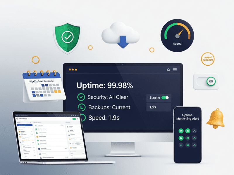
We designed and built a complete landing page and sales page system for Ascend Academy — creating 28 conversion-optimized pages across lead generation, webinar registration, course sales, and upsell funnels, increasing overall conversion rate from 1.8% to 6.4%, generating $340K in course launch revenue from a single sales page, and establishing a reusable template system that produces new high-converting pages in under 2 hours.
WordPress, Elementor Pro, Advanced Custom Fields (ACF) Pro, Figma (design), CartFlows Pro (funnel builder), OptinMonster (popups & exit intent), Google Optimize (A/B testing), Hotjar (heatmaps & recordings), Google Analytics 4, Google Tag Manager, Meta Pixel, TikTok Pixel, Stripe (payments), WooCommerce (course checkout), LearnDash (LMS integration), Klaviyo (email integration), WP Rocket, Cloudflare, ShortPixel, Notion, Slack, Loom
Project Year
2025
The Overview
Ascend Academy is an online professional development platform offering courses, certifications, and coaching programs in digital marketing, data analytics, and product management. Founded by two ex-Google product managers in San Francisco, the platform serves mid-career professionals aged 28-42 looking to upskill or pivot into high-demand tech careers. Course prices range from $197 (self-paced) to $2,497 (cohort-based with coaching). Annual revenue: $1.6M. Email list: 42,000 subscribers. Monthly site traffic: 85,000 visitors.
Ascend had exceptional products — 4.8-star average across 3,200+ reviews, alumni working at Google, Meta, Stripe, and Shopify, and a 94% completion rate (vs. industry average of 15%). Their course content was genuinely transformative.
But their landing pages were killing conversions.
Every course, lead magnet, webinar, and offer pointed to the same generic page template — a WordPress page with a hero image, three paragraphs of text, a bullet list, and a “Buy Now” button. No social proof. No objection handling. No urgency. No structured persuasion sequence. No visual hierarchy guiding the eye. No trust signals. No video. No testimonials beyond a single text quote at the bottom.
Their flagship “Product Management Career Accelerator” ($1,497) — a course that genuinely changed careers — was being sold on a page that looked like a college course description. Meanwhile, competitors like Maven, Reforge, and Section4 had invested heavily in conversion-optimized sales pages with video sales letters, structured benefit cascades, student success stories, instructor credibility sections, FAQ accordions, and multi-CTA placement.
We designed and built a complete landing page and sales page system — from strategic funnel mapping and page-level conversion architecture to high-converting sales pages, lead magnet pages, webinar registration flows, thank you pages, and a template system for rapid future page creation — giving Ascend pages that convert as powerfully as their courses educate.
Launch page: waitlist → cart open → enrollment closing sequence with deadline
Upsell/cross-sell
Didn’t exist
Post-purchase one-click upsell pages in checkout funnel
Thank you / confirmation
Default WordPress “form submitted” text
Branded confirmation with next steps, bonus offer, community onboarding
Conversion Performance Crisis:
Metric
Ascend (Before)
Industry Benchmark (Online Education)
Gap
Sales Page Conversion (Visit → Purchase)
1.8%
4.0%-7.0%
55-74% below
Lead Magnet Page Conversion
12%
30-45%
60-73% below
Webinar Registration Conversion
18%
40-55%
55-67% below
Webinar Attendance Rate
22%
35-45%
37-51% below
Post-Purchase Upsell Rate
0% (no upsells existed)
15-25%
Not even attempted
Email → Sales Page → Purchase
0.4%
2.0-4.0%
80-90% below
Average Revenue Per Visitor (Sales Pages)
$2.14
$8.00-$15.00
73-86% below
No Funnel Architecture: Every page was isolated — no strategic connection between lead magnet → email nurture → webinar → sales page → upsell → onboarding. Visitors landed on a sales page cold with no prior warming, or they were nurtured via email but sent to the same generic page a cold visitor would see. No personalization, no funnel sequencing, no behavioral triggers.
Competitor Landing Page Sophistication:
Competitor
Sales Page Approach
Conversion Elements
Maven
Cohort-based launch pages with instructor credibility, syllabus preview, student testimonials, enrollment countdown, social proof tickers
Urgency, authority, specificity
Reforge
Long-form with detailed program breakdown, alumni company logos, outcome metrics, tiered pricing comparison, application process
Strong closing CTA with emotional summary — “Your future career starts with this decision”
Bottom
Commitment — final push at peak conviction
Phase 2: Sales Page Design & Development (Week 2-3)
Flagship Sales Page — “Product Management Career Accelerator” ($1,497):
Section
Content Elements
Design Treatment
Hero
Headline: “Become the Product Manager Companies Fight to Hire — in 8 Weeks.” Subhead: “The career accelerator trusted by 2,400+ professionals now at Google, Stripe, Shopify, and 200+ top companies.” Primary CTA: “Enroll Now — $1,497 (or 3 payments of $549).” Video Sales Letter (VSL): 12-minute founder-led video. Trust bar: “4.8★ from 1,400+ reviews”
Full-width, dark background (Deep Navy #1A1F36), white headline text, accent CTA button (Electric Blue #3B82F6), VSL centered, trust badges below
Problem
“You’ve been reading blog posts, watching YouTube tutorials, and collecting bookmarks for months. Maybe years. You know you could be a PM — but the gap between ‘interested in product’ and ‘hired as a PM’ feels wider every day.” 3 pain points with icons.
Warm background shift (soft cream), empathetic copy, pain-point cards with subtle red accents
Solution
“Ascend’s Product Management Career Accelerator isn’t another course. It’s a career transformation system — curriculum designed by ex-Google PMs, practiced through real product cases, and supported by a hiring network that gets you interviews.”
Logo ticker (auto-scroll), metrics in bold accent numbers, dark bar background
Benefit Cascade
6 key outcomes — each: icon + outcome headline + supporting sentence. “Master the PM interview framework that lands offers at FAANG companies.” “Build a portfolio of 4 real product cases — not theoretical exercises.”
Accordion with smooth expand animation, module number badges, progress-bar visual
Instructor Section
Founder photos, ex-Google PM credentials, years of experience, “featured in” logos, personal video message (2 min)
Side-by-side layout: photo left, credentials right. Personal, not corporate.
Testimonials
6 video testimonials (30-60 sec each) + 12 text reviews with photos. Organized by outcome: “Got hired at Google,” “Promoted to Senior PM,” “Career pivoted from engineering.”
Video grid (3×2 desktop, scrollable mobile), text reviews in masonry layout with company logos
FAQ
8 questions: “Is this right for me if I have no PM experience?” “What if I can’t commit 10 hrs/week?” “How is this different from free resources?” “What’s the refund policy?” “Do you offer payment plans?” “Will this help me get hired?” “How long do I have access?” “What support is included?”
Expandable accordion, each answer 3-5 sentences, objection-handling tone
Guarantee
“30-Day ‘No Questions Asked’ Money-Back Guarantee. Complete the first 3 modules. If you don’t feel it’s worth 10x what you paid, email us and we’ll refund every cent. No hoops. No forms. No questions.”
Trust badge (shield icon), green accent, guarantee border/box, founder signature
Pricing
Value stack: “Curriculum ($2,400 value) + Case Studies ($800) + Community ($600) + Career Coaching ($1,200) + Interview Prep ($400) = Total Value: $5,400.” Price: “$1,497 one-time” or “3 monthly payments of $549.” Comparison: “That’s less than a single session with a career coach — for 8 weeks of comprehensive PM training.”
Pricing card with shadow, value stack as strikethrough list, two pricing options side-by-side, comparison line in italic below
Urgency
“Next cohort starts 2026. 40 seats available. [X] seats remaining.” Live countdown timer to enrollment deadline.
“Your PM Career Starts Here.” Summary: “8-week program. Expert instruction. Real cases. Career support. 30-day guarantee. Join 2,400+ professionals who made the leap.” Two buttons: “Enroll Now — $1,497” / “Have Questions? Book a Free Call”
Specific, benefit-driven: “The 2025 Product Manager Salary Guide — Salary Data from 12,000+ PMs Across 6 Countries”
Clearly states what they get and why it’s valuable
Supporting Visual
3D mockup of the guide (PDF cover + sample pages visible)
Makes the freebie feel tangible and premium — not just “another PDF”
3-4 Bullet Points
What’s inside: “Salary ranges by company size, city, and experience level” / “Negotiation scripts that increased offers by 18% on average” / “The 5 highest-paying PM specializations in 2025”
Specific, data-driven value statements — not vague promises
Form
Name + Email only (2 fields). CTA button: “Send Me the Free Guide →” (not “Submit”)
Minimal friction — every additional field reduces conversion 10-15%
Social Proof
“Downloaded by 14,200+ product managers” + 3 mini-testimonials (“This guide helped me negotiate a $22K raise” — Sarah K.)
Trust at the conversion point
Zero Distractions
No main navigation, no footer links, no sidebar. Single purpose: download the guide.
Remove every possible exit — the only action available is converting
Webinar Registration Page Design:
Element
Content
Design
Headline
“Free Live Workshop: How to Land a $180K+ PM Role in 2025 — Even If You’ve Never Been a Product Manager”
Bold, specific, aspirational. “$180K+” = concrete, desirable number
Date/Time
“[Day], [Date] at [Time] [Timezone]” — with timezone converter link
Prominent — visitors need to know WHEN before deciding to register
Speaker Bio
Founder photo + “Ex-Google PM, 12 years in product, trained 2,400+ PMs” — 2-sentence bio
Authority positioning — “this person is worth my time”
What You’ll Learn
4 bullet points: “The 3-step framework for transitioning into PM without starting over” / “How to build a PM portfolio that gets interviews (even without PM experience)” / “The salary negotiation mistake that costs PMs $15K-$30K” / “Live Q&A — bring your specific questions”
Value preview — enough to create desire, not so much they feel they don’t need to attend
Registration Form
Name + Email + “Will you attend live or watch the replay?” (radio button)
Replay option captures registrants who can’t make the live time — increases registrations 20-30%
Simple: Headline → 3 benefits → Testimonial from coaching client → “Yes, Add Coaching” / “No thanks, take me to my course”
Upsell 2 — Bundle Upgrade
After purchasing single course ($197-$497)
“Upgrade to the Complete PM Bundle — all 4 courses for $297 more (save $394)”
Value comparison: Individual total vs. bundle price → What’s included → “Yes, Upgrade My Order” / “No thanks”
Upsell 3 — Annual Membership
After purchasing any product
“Join Ascend Unlimited — 12 months of every course, every update, every new release. $997/year (normally $1,997)”
Premium offer: Everything included → Savings calculation → Community access → “Yes, I Want Unlimited Access”
Downsell
If upsell declined
Same product at payment plan: “How about $97/month for 6 months instead?”
Gentler pricing → Same benefits → Easy payment plan
All upsells are one-click — no re-entering payment info. Charged to same card used in initial purchase.
CartFlows handles upsell flow — each upsell/downsell step is a dedicated page with accept/decline buttons.
Thank You & Confirmation Pages:
Thank You Page
Trigger
Content
Strategic Purpose
Lead Magnet TY
After downloading free guide
“Your guide is on its way! 📧 Check your inbox.” + Bonus: “While you wait — watch this 5-minute video on the #1 mistake career-switching PMs make” (video embed) + “Join our free PM community” link
Deepens engagement, warms lead for next funnel step, introduces video content (builds familiarity with instructors)
Webinar Registration TY
After registering for webinar
“You’re registered! 🎉” + Calendar add buttons (Google Cal, iCal, Outlook) + “Set a reminder” + “Share with a colleague” (pre-written social/email share) + “Bonus: Download the PM Career Roadmap while you wait”
Increases attendance (calendar add), extends reach (sharing), provides immediate value
Purchase TY
After course purchase
“Welcome to Ascend! 🚀” + “What happens next” (3 steps: check email → set up account → start Module 1) + Course access button + Community link + “Bookmark this page — it’s your launch pad”
Validates decision, prevents confusion about what they now have access to
Phase 4: CRO, A/B Testing & Analytics (Week 4)
Conversion Rate Optimization (CRO) Elements — Built Into Every Page:
CRO Element
Implementation
Pages Applied
Exit-Intent Popup
OptinMonster: detects cursor moving to close/back → displays popup with offer. Lead magnet pages: “Wait! Get the guide + our exclusive PM Toolkit (bonus).” Sales pages: “Before you go — book a free 15-min strategy call.”
All lead magnet + sales pages
Sticky CTA Bar
Fixed bottom bar (mobile) / floating side button (desktop) — “Enroll Now” always visible as user scrolls long-form pages
Sales pages, course launch pages
Micro-Commitments
Interactive elements throughout long pages: “Does this sound like you?” (yes/no), “What’s your biggest PM challenge?” (poll), “How many of these apply to you?” (checklist)
Sales pages — increases engagement + scroll depth
Social Proof Notifications
“Sarah from New York just enrolled” — real-time (or near-real-time) purchase notifications
Sales pages (subtle, bottom-left popup)
Progress Indicator
Subtle scroll progress bar on long-form sales pages — “you’re 60% through”
Sales pages — reduces abandonment on long pages
Dynamic Content
URL parameters populate personalized content: utm_source=webinar shows “As promised in the webinar…” hero text. utm_source=email shows “Thanks for being a subscriber — here’s your exclusive offer.”
Challenge: Ascend Academy — an online professional development platform with $1.6M revenue, 42K email subscribers, 4.8-star reviews, and alumni at Google, Meta, and Stripe — was using a single generic WordPress page template for every purpose: course sales, lead magnets, webinars, and launches. Sales page conversion was 1.8% (industry: 4-7%). Lead magnet conversion was 12% (industry: 30-45%). No checkout optimization, no upsells, no exit-intent recovery, no A/B testing, no funnel architecture. Competitors like Maven and Reforge had sophisticated conversion systems while Ascend sold $1,497 courses on pages that looked like blog posts.
Solution: We designed and built a complete landing page and sales page system — 4 strategic funnels (lead magnet, webinar, course launch, tripwire); 28 conversion-optimized pages; a 13-section persuasion sequence based on conversion psychology; CartFlows checkout funnels with order bumps and one-click upsells; dynamic UTM-based personalization; exit-intent recovery popups; built-in CRO elements (sticky CTAs, micro-commitments, scarcity counters, progress indicators); an 8-type A/B testing framework; full analytics stack (GA4, GTM, Meta/TikTok pixels, Hotjar); and an 8-template reusable system enabling new page creation in under 2 hours.
Result: Sales page conversion jumped from 1.8% to 6.4%. Lead magnet conversion grew from 12% to 42%. Webinar registration hit 52%. Order bumps achieved 22% take rate and upsells 18% — lifting AOV 51% ($412 → $624). Revenue per visitor grew 591%. Flagship course launch generated $340K (vs. $82K previously). Evergreen funnel revenue grew 167% to $128K/month. Exit-intent recovery captured 8.4% of exiting visitors. 24 A/B tests conducted with 14 winners implemented. Cumulative 6-month revenue impact: $940K. New pages now take 2 hours instead of 3 weeks.
Your Traffic Isn’t the Problem. Your Pages Are.
We design and build landing pages and sales pages with proven conversion architecture — persuasion sequences, checkout optimization, upsell funnels, and A/B testing frameworks that turn the same traffic into dramatically more revenue.
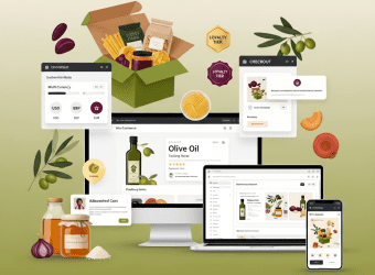
We designed and built a complete WooCommerce e-commerce store for Terranova Provisions — a custom-designed, conversion-optimized online shop with subscription system, multi-currency checkout, loyalty program, and abandoned cart recovery, increasing conversion rate from 1.1% to 4.2%, growing monthly revenue 218%, and reducing cart abandonment by 38%.
Terranova Provisions is an artisan food brand based in Napa Valley, California, sourcing and curating small-batch pantry goods — single-origin olive oils, aged balsamic vinegars, artisan pasta, hand-harvested sea salts, specialty honeys, and curated gift boxes. Their products are sourced from small family producers across Italy, Spain, Greece, and California. Price range: $14 (individual items) to $185 (luxury gift collections). Average order value: $72.
Terranova had been selling through a combination of farmers’ markets, wholesale to specialty grocery stores, and a basic Shopify store they’d outgrown. With 6,800+ email subscribers, a passionate customer base (4.8-star average, 2,100+ reviews), and growing demand from customers across the US, Canada, UK, and Australia — they needed a robust e-commerce platform that could support their growth from a $380K/year side business into a $1.5M+ D2C brand.
They chose WordPress/WooCommerce over Shopify for several reasons — full design control (their brand aesthetic required customization Shopify themes couldn’t deliver), content marketing integration (their blog/recipe content was a major traffic driver and needed deep CMS integration), cost efficiency at scale (no percentage-based transaction fees eating into margins on $185 gift boxes), and plugin ecosystem flexibility (subscriptions, loyalty, multi-currency, and advanced shipping logic all needed to work together without $300+/month in Shopify app fees).
But their existing Shopify store was a mess — a free theme with default styling, product pages with single photos and two-sentence descriptions, no subscription option despite customers constantly requesting it, no gift box builder, US-only shipping, a checkout flow that lost 74% of carts, and a mobile experience that made purchasing feel like a chore.
We designed and built a complete WooCommerce e-commerce store — from brand-aligned design and conversion-optimized product pages to subscription integration, multi-currency checkout, automated abandoned cart recovery, a customer loyalty program, and a shipping/tax system supporting 4 countries — giving Terranova a digital storefront as thoughtfully curated as their products.
The Challenge
Outgrown Platform with Critical Gaps:
Gap
Impact
No subscription capability
Customers asked monthly for a “pantry subscription box” — Terranova was losing recurring revenue and lifetime value. Competitors like Mouth.com and Zingerman’s had thriving subscription programs.
US-only shipping
22% of website traffic came from Canada, UK, and Australia — all hitting a dead end at checkout. Estimated $8,400/month in lost international revenue.
No gift box builder
Gift boxes (highest AOV at $120-$185) were pre-configured only — customers couldn’t customize. Competitor analysis showed customizable gift builders increased AOV by 35-40%.
Single product photo, minimal descriptions
Product pages had 1 photo (white background) and 2-3 sentences. For artisan food — where provenance, flavor profile, pairing suggestions, and producer stories drive purchases — this was selling $28 olive oil like it was a commodity.
74% cart abandonment
No abandoned cart emails, no exit-intent offers, no guest checkout option, no saved carts. Nearly 3 out of 4 shoppers who added items left without buying.
Conversion & Revenue Performance:
Metric
Current (Shopify)
Industry Benchmark (Artisan Food D2C)
Gap
Conversion Rate
1.1%
3.0%-4.5%
63-76% below
Cart Abandonment Rate
74%
55-62%
12-19 points above
Average Order Value
$58
$70-$90
17-36% below
Mobile Conversion Rate
0.4%
2.0%-3.5%
80-89% below
Returning Customer Rate
18%
35-45%
17-27 points below
Revenue from Email
$1,200/month
Should be 25-35% of D2C revenue
Massively underperforming
International Revenue
$0
~20% of addressable market
Completely untapped
Competitor E-Commerce Sophistication:
Competitor
Platform
Key Features
Terranova Gap
Mouth.com
Custom
Beautiful product storytelling, gift builder, subscriptions, curated collections, tasting notes
No storytelling, no gift builder, no subscriptions
Zingerman’s
Custom
Deep producer stories, detailed tasting notes, food pairing guides, subscription clubs, loyalty program
No producer stories, no pairings, no loyalty
Eataly (Online)
Shopify Plus
Immersive brand experience, recipe integration, collection-based shopping, robust international shipping
No recipes on product pages, no international shipping
TERRANOVA PROVISIONS — SITE ARCHITECTURE
━━━━━━━━━━━━━━━━━━━━━━━━━━━━━━━━━━━━━━━━

HOME
├── SHOP
│   ├── All Products (filterable)
│   ├── Olive Oils & Vinegars
│   ├── Pasta & Grains
│   ├── Honey & Preserves
│   ├── Salts & Seasonings
│   ├── Gift Collections
│   │   ├── Pre-Curated Gift Boxes
│   │   └── Build Your Own Gift Box
│   ├── Subscriptions
│   │   ├── The Pantry Box (Monthly)
│   │   ├── The Olive Oil Club (Quarterly)
│   │   └── Gift a Subscription
│   └── New Arrivals / Seasonal
│
├── PRODUCERS
│   ├── All Producers (interactive map)
│   └── [Individual Producer Profiles]
│
├── JOURNAL (Blog + Recipes)
│   ├── Recipes
│   ├── Producer Stories
│   ├── Food & Pairing Guides
│   └── Behind the Sourcing
│
├── OUR STORY
│   ├── About Terranova
│   ├── Sourcing Philosophy
│   └── Sustainability
│
├── ACCOUNT
│   ├── Dashboard
│   ├── Orders & Subscriptions
│   ├── Loyalty Points
│   ├── Wishlist
│   └── Saved Addresses
│
├── CART → CHECKOUT
│
└── FOOTER
    ├── Shipping & Returns
    ├── FAQ
    ├── Contact
    ├── Newsletter Signup
    ├── Social Links
    └── Privacy / Terms
━━━━━━━━━━━━━━━━━━━━━━━━━━━━━━
Conversion-Focused UX Principles:
Principle
Application
“Buy with Confidence”
Every product page answers: What is it? Where does it come from? How does it taste? What do I pair it with? What do other customers say? — trust built before purchase
First impression — gallery tells the full story. Multiple images reduce uncertainty.
Producer Story
Producer name (linked to producer profile), Location with flag, “Since 2026” badge, 2-sentence producer summary, “Meet the Producer →” link
Provenance sells artisan food. Knowing WHO made it builds emotional connection and justifies premium pricing.
Tasting Notes
Flavor profile (visual taste wheel or descriptive tags: “peppery, fruity, herbaceous”), Intensity scale (1-5), Suggested use (finishing, cooking, dipping)
Helps customers choose the right product — reduces decision anxiety and returns.
Pairing Suggestions
“Pairs beautifully with:” — 3-4 linked products from other categories. Recipe link: “Try it in our [recipe name]”
Cross-selling that feels helpful, not salesy. Drives AOV naturally.
Customer Reviews
Star rating, review count, “Verified Buyer” badge, photo reviews, review filtering (sort by rating, recency)
Social proof at the point of purchase — the #1 conversion driver for food products.
Complete Your Pantry
“Frequently Bought Together” — AI-suggested pairings based on purchase data. “Customers Also Bought” carousel.
AOV builder — “you’re getting olive oil, you probably need the balsamic and pasta too.”
Subscription Option
Toggle: “One-time purchase: $28” / “Subscribe & save 15%: $23.80 — delivered every 1/2/3 months”
Recurring revenue with built-in incentive. WooCommerce Subscriptions plugin.
Shipping & Returns
Estimated delivery date (based on location detection), free shipping threshold indicator (“Add $12 more for free shipping”), return policy summary
Removes friction — shipping uncertainty is the #2 reason for cart abandonment after price.
Gift Box Builder System:
Feature
Implementation
UX Flow
Pre-Curated Boxes
6 themed gift collections (The Italian Kitchen, Mediterranean Essentials, Olive Oil Lover, Sweet & Savory, The Entertainer, Bestsellers Box) — each a grouped product with fixed contents
Browse → Select box → Add message → Add to cart. Simple for customers who want curation.
Clean permalinks (/shop/olive-oils/sicilian-extra-virgin/), breadcrumb navigation, XML sitemap with product/category/blog separation
Content SEO
Blog/recipe content targeting long-tail keywords: “best olive oil for pasta,” “how to choose balsamic vinegar,” “artisan food gift ideas”
Technical SEO
Canonical URLs on product variants, noindex for cart/checkout/account pages, structured internal linking between related products/recipes/producers
Launch Testing Checklist:
Category
Tests
Purchase Flow
Complete purchase test (every payment method × every currency × every shipping zone), subscription purchase, gift box builder, coupon code application, guest checkout, account checkout
Email Flows
Order confirmation delivery, shipping notification trigger, abandoned cart sequence (test with real abandonment), welcome series trigger, subscription emails
Responsive
Full checkout flow on iPhone, Android, iPad, desktop — every breakpoint tested
Performance
Homepage < 2s, product page < 2.5s, category page < 2s, checkout < 2s — across all regions (tested via GTmetrix from multiple locations)
ShipStation configuration, TaxJar settings, adding new shipping zones, rate adjustments
Email Flow Documentation
All automated email sequences with triggers, timing, content, and edit instructions
Loyalty Program Guide
Points system management, tier adjustments, manual point awards, redemption settings
SEO Guidelines
Product SEO checklist, category page optimization, blog content SEO guide
Performance Monitoring
Speed benchmarks, tools to monitor, red flags, when to contact support
Emergency Procedures
Site down protocol, payment issues, shipping disruptions, security incidents
Key Features Delivered
Feature
Description
Custom WooCommerce Store Design
Brand-aligned visual system (Olive/Cream/Terracotta palette, DM Serif Display headlines, artisan photography style) with mobile-first responsive design
ACF-Enhanced Product Pages
Rich product pages with 8 content sections: hero gallery, producer story, tasting notes, pairing suggestions, reviews, cross-sells, subscription toggle, and shipping info
Gift Box Builder
Interactive step-by-step builder: choose size → select products → add message → choose wrapping → add to cart. Plus 6 pre-curated gift collections and corporate gifting system
Subscription System
2 subscription products (The Pantry Box, The Olive Oil Club) + gift subscriptions with full customer management (skip, pause, swap, cancel)
Multi-Currency Checkout
5 currencies (USD, CAD, GBP, AUD, EUR) with IP-based auto-detection and manual toggle via Stripe multi-currency
4-Country Shipping & Tax
ShipStation integration with zone-based rates, free shipping thresholds, and TaxJar automated tax compliance (US sales tax, Canadian GST, UK VAT, Australian GST)
Abandoned Cart Recovery
3-email escalating sequence (1hr, 24hr, 72hr) with incentive progression — recovering an estimated 12-18% of abandoned carts
Customer Loyalty Program
Points-based system with 3 tiers (Seedling, Grower, Harvest), 8 earning actions, and escalating benefits including free shipping and exclusive products
6 Automated Email Flows
Welcome, post-purchase, subscription onboarding, win-back, replenishment, and birthday — with branded transactional emails
$22,400 (22% of total — from welcome, post-purchase, abandoned cart, replenishment flows)
⬆ 1,767%
Customer Reviews Collected
12/month
86/month (loyalty points incentive)
⬆ 617%
Corporate Gift Inquiries
0
8-12/month (dedicated landing page)
—
Subscription Churn Rate
N/A
6.2%/month (industry avg: 8-12%)
Below average (good)
Cost Savings (Platform Fees)
~$380/month (Shopify + apps)
~$95/month (hosting + plugins)
⬇ 75%
📋 Case Study Summary
Challenge: Terranova Provisions — an artisan food brand with 6,800+ subscribers, 4.8-star reviews, and growing demand across 4 countries — was stuck on an outgrown Shopify store with 1.1% conversion rate, 74% cart abandonment, no subscription capability, no gift box builder, US-only shipping, single-photo product pages with minimal descriptions, and no loyalty program. Their $380K/year business was constrained by a platform that couldn’t support their growth ambitions.
Solution: We designed and built a complete WooCommerce e-commerce store — custom brand-aligned design with ACF-enhanced product pages (gallery, producer stories, tasting notes, pairings, reviews, cross-sells); an interactive gift box builder with pre-curated and custom options; a subscription system with full customer management; multi-currency checkout (USD/CAD/GBP/AUD/EUR) via Stripe; 4-country shipping via ShipStation with automated tax via TaxJar; 3-email abandoned cart recovery; a 3-tier loyalty program with 8 earning actions; 6 automated email flows via Klaviyo/AutomateWoo; conversion-optimized single-page checkout with express payment; producer profile system; sub-2-second performance globally; and e-commerce SEO foundation with product schema and recipe content strategy.
Result: Conversion rate grew from 1.1% to 4.2%. Cart abandonment dropped from 74% to 46%. AOV increased 48% ($58 → $86). Monthly revenue grew 218% ($31.6K → $100.4K). International sales reached $18.2K/month from zero. Subscription MRR hit $14.8K with 148 subscribers. Gift box revenue grew 290%. Abandoned cart recovery generated $7.8K/month. Returning customer rate doubled to 38%. Email revenue grew 1,767% to $22.4K/month. Loyalty program enrolled 1,840 members who spend 2.4x more than non-members. Platform costs dropped 75%. Terranova’s digital storefront finally matches the artisanal quality of their products.
Your Products Deserve a Store That Sells as Well as They Taste
We build WooCommerce e-commerce stores that combine stunning design with conversion science — subscriptions, gift builders, multi-currency checkout, loyalty programs, and the kind of product storytelling that turns browsers into buyers and buyers into subscribers.
We designed and developed a custom WordPress website for Meridian Architecture — building a portfolio-driven, visually stunning, lightning-fast digital presence that increased qualified project inquiries by 280%, improved page load speed from 8.4s to 1.6s, achieved 96+ scores across all Core Web Vitals, and positioned the studio as one of the most digitally sophisticated architecture practices in the Pacific Northwest.
Architecture & Interior Design / Professional Services
Project Duration
6 Weeks
Services Delivered
Discovery & Information Architecture, Custom WordPress Theme Development, Portfolio & Case Study System, Team & Culture Pages, Interactive Project Gallery, Blog & Thought Leadership Hub, Contact & Lead Generation System, Responsive Design (Mobile-First), Accessibility Compliance (WCAG 2.1 AA), Performance Optimization, SEO Foundation, CMS Training & Documentation
Tools & Platforms Used
WordPress (self-hosted), Elementor Pro, Advanced Custom Fields (ACF) Pro, Custom PHP/CSS/JS, Figma (design), Adobe Photoshop/Lightroom (image optimization), WP Rocket (caching), ShortPixel (image compression), Yoast SEO Premium, Gravity Forms, WPForms, Google Analytics 4, Google Tag Manager, Google Search Console, Hotjar, Cloudflare (CDN & security), WP Mail SMTP, UpdraftPlus (backups), Notion, Slack, Loom
Project Year
2025
The Overview
Meridian Architecture is an award-winning architecture and interior design studio based in Seattle, with a team of 24 across two offices (Seattle and Portland). They specialize in three verticals — luxury residential (custom homes and renovations), boutique hospitality (hotels, restaurants, wellness spaces), and cultural/institutional projects (galleries, museums, libraries). Their portfolio includes 140+ completed projects across 18 years, with recognition from AIA, Dezeen Awards, and Architectural Digest.
Their work was extraordinary. Their website was not.
Meridian’s existing website was built in 2018 on a generic WordPress theme with a page builder that had since been abandoned by its developer. The site was slow (8.4-second average load time), unresponsive on mobile (content overflowed, images cropped incorrectly, navigation broke on tablets), visually outdated (stock photography mixed with project photos, inconsistent typography, cluttered layouts), and structurally broken (portfolio was a basic grid of thumbnails with no filtering, no case study structure, no project narratives — just photos dumped in a gallery).
For an architecture studio, the website IS the portfolio. It’s the first thing prospective clients visit after a referral. It’s what they share with their partners, their investors, their boards. A $2M custom home project or a $15M boutique hotel commission doesn’t go to a studio with a broken, slow, ugly website — regardless of how beautiful their buildings are. Meridian’s website was actively losing them projects.
We designed and developed a custom WordPress website — from information architecture and UI/UX design to custom theme development, an advanced portfolio system, performance optimization, and SEO foundation — giving Meridian a digital presence as thoughtfully crafted as their buildings.
The Challenge
Website as Anti-Portfolio:
Problem
Impact
8.4-second load time
53% of visitors left before the site fully loaded (Google Analytics bounce rate data). For architecture — where first impressions are everything — half of prospects never saw a single project.
Broken mobile experience
62% of traffic was mobile, but the site was barely functional on phones — images overflowed, text overlapped navigation, portfolio grid collapsed into single-column chaos.
No project case studies
140+ projects reduced to thumbnail grids with a title and 6 photos. No project narrative, no design challenge, no solution explanation, no client context. The work that won Dezeen Awards was presented with less sophistication than a Pinterest board.
No filtering or categorization
Visitors couldn’t filter by project type (residential/hospitality/cultural), location, year, or size. Finding a relevant project in 140+ thumbnails was impossible — clients gave up.
Outdated visual design
The 2018 template looked dated — generic layouts, inconsistent spacing, stock photography mixed with project photos destroyed credibility.
SEO invisible
No meta descriptions, no structured data, no XML sitemap optimization, no internal linking strategy. The site ranked for nothing beyond the brand name.
Meridian’s site looked like a student portfolio in comparison
Bohlin Cywinski Jackson
Excellent
Clean grid, detailed project pages, strong filtering, thought leadership blog, team culture pages
Meridian had no filtering, no blog, minimal team presence
Lake
Flato
Excellent
Award-winning web design, video integration, sustainability storytelling, interactive project maps
Meridian Architecture
Poor
Generic theme, thumbnail grid, broken mobile, slow load, no case studies
Complete digital transformation needed
Lost Business (Estimated):
Signal
Data
Bounce rate
64% (industry average for well-designed architecture sites: 35-40%)
Average session duration
1:12 (should be 3:00+ for portfolio browsing)
Contact form submissions/month
4-6 (from a site getting 3,200 monthly visits)
Conversion rate (visit → inquiry)
0.15% (industry: 1.5-3.0%)
Client feedback
Multiple referral sources reported: “I sent them to your website but they said it was hard to navigate”
RFP qualification
Lost 3 hotel RFPs in 12 months where decision-makers cited “digital presence” as a factor
Our Approach & Strategy
Phase 1: Discovery, Information Architecture & UX Strategy (Week 1)
Stakeholder Discovery:
Discovery Method
Purpose
Key Findings
Founder/Principal Interviews (3 sessions)
Understand brand vision, business goals, competitive positioning
“We win projects through relationships and portfolio quality. The website should do what a 90-minute studio tour does — immerse them in our work, show how we think, and make them want to work with us.”
Team Input Survey
Understand internal needs, content pain points
Team wanted: easy project uploads without developer help, blog publishing capability, team profile management
Client Journey Analysis
Map how prospective clients interact with the site
Referral → Google brand search → Website → Portfolio → 2-3 project case studies → About/Team → Contact. Mobile-first for initial discovery, desktop for deep portfolio review
Analytics Deep-Dive
Understand current behavior patterns
Top pages: Homepage (38%), Portfolio grid (24%), About (12%), Contact (8%). Exit pages: Portfolio grid (users couldn’t find relevant projects and left)
MERIDIAN ARCHITECTURE — SITE ARCHITECTURE
━━━━━━━━━━━━━━━━━━━━━━━━━━━━━━━━━━━━━━━━━

HOME
├── WORK (Portfolio Hub)
│   ├── All Projects (filterable grid)
│   ├── Residential
│   │   └── [Individual Project Case Studies]
│   ├── Hospitality
│   │   └── [Individual Project Case Studies]
│   ├── Cultural & Institutional
│   │   └── [Individual Project Case Studies]
│   └── Featured Projects (curated hero selection)
│
├── APPROACH
│   ├── Design Philosophy
│   ├── Process (how we work)
│   └── Sustainability
│
├── STUDIO
│   ├── Our Story
│   ├── Team (individual profiles)
│   ├── Awards & Recognition
│   ├── Careers
│   └── Press & Media
│
├── JOURNAL (Blog/Thought Leadership)
│   ├── Design Insights
│   ├── Project Stories
│   ├── Industry Perspectives
│   └── Studio News
│
├── CONTACT
│   ├── Project Inquiry Form
│   ├── General Contact
│   ├── Office Locations (Seattle + Portland)
│   └── Careers Application
│
└── FOOTER
    ├── Newsletter Signup
    ├── Social Links
    ├── Privacy Policy / Terms
    └── Accessibility Statement
━━━━━━━━━━━━━━━━━━━━━━━━━━━━━━━━━━━━━
User Experience (UX) Principles:
Principle
Application
“The Work Speaks First”
Homepage opens with full-bleed project imagery — no hero text block, no slider with corporate messaging. The architecture IS the hero.
Frictionless Portfolio Navigation
Smart filtering (type, location, year, size), persistent navigation, “Next Project” flow that keeps visitors immersed in portfolio without returning to grid
Progressive Disclosure
Don’t overwhelm — reveal information in layers. Grid → Project overview → Full case study → Contact CTA. Each layer deeper = higher intent = more detail
Mobile-First, Desktop-Enhanced
Design for phone first, then enhance for desktop. Touch-friendly gallery navigation, thumb-zone CTA placement, swipe-enabled project browsing
Speed as Experience
Sub-2-second load time is non-negotiable. Every image lazy-loaded, every asset optimized, caching configured, CDN distributed
Accessibility as Standard
WCAG 2.1 AA compliance — alt text, keyboard navigation, color contrast, screen reader compatibility, focus indicators
Phase 2: UI Design & Visual System (Week 2)
Design System — Visual Language:
Element
Specification
Rationale
Color Palette
Primary: Charcoal (#1C1C1C), Warm White (#F8F6F3). Accent: Brass (#B8956A). Supporting: Cool Gray (#6B6B6B), Light Stone (#EDEAE5)
Neutral palette lets project photography shine — the work is the color. Brass accent adds warmth and material quality (mirrors architectural brass details).
Typography
Headlines: Inter (700, 600). Body: Inter (400, 300). Accent: Playfair Display (for quotes/pull-outs)
Inter: clean, architectural, excellent readability. Playfair: editorial warmth for narrative moments. Single font family (Inter) for performance + consistency.
Layout Grid
12-column grid, 1440px max container, 24px gutters, 80px section padding. Generous whitespace philosophy — “let the work breathe.”
Architecture is about space. The website should feel spacious, not cramped. Every element has room.
Image Treatment
Full-bleed heroes, consistent aspect ratios (16:9 for landscape, 4:5 for portrait, 1:1 for grid thumbnails), subtle parallax on scroll, no rounded corners (sharp, architectural)
The visual portfolio — supporting the narrative with stunning photography
Project Metrics
Awards Won (repeater), Press Features (repeater: publication + link), Client Testimonial (textarea + client name + role)
Repeater, Text
Credibility signals — awards, press, and client words
Related Projects
Related Projects (relationship to other Projects CPT)
Relationship
Keeps visitors browsing — “If you liked this, see these”
SEO
SEO Title, Meta Description, Focus Keyphrase
Text
Per-project SEO optimization
Portfolio Filtering System:
Feature
Implementation
User Experience
Filter Bar
AJAX-powered filtering — no page reload. Filters: Project Type (Residential / Hospitality / Cultural), Location (dropdown), Year Range (slider), Size Range (slider)
Descriptive filenames (meridian-lakewood-residence-living-room.webp), alt text on every image (800+ images), title attributes, lazy loading with noscript fallback
Local SEO
Google Business Profile linked, NAP consistency (Name, Address, Phone), Seattle and Portland office pages with embedded maps
Core Web Vitals
LCP < 2.0s, FID < 100ms, CLS < 0.1 — optimized and monitored via Google Search Console
Lead Generation System:
Element
Implementation
Purpose
Project Inquiry Form
Gravity Forms: structured fields — Name, Email, Phone, Company/Organization, Project Type (Residential/Hospitality/Cultural/Other), Estimated Budget Range (select), Estimated Timeline (select), Project Location, Project Description (textarea), How Did You Hear About Us (select)
Qualifies leads before the first call — saves studio time and signals professionalism
Right inquiry reaches the right team lead automatically
Auto-Response
Branded HTML email with: “Thank you for your interest in Meridian. A member of our team will respond within 2 business days.” + Link to portfolio + Office information
Professional immediate response — sets expectations, keeps prospect engaged
CTA Placement
Strategic CTAs throughout: bottom of every project case study (“Inspired? Let’s discuss your project.”), About page (“Ready to start something exceptional?”), Journal articles (“Have a project in mind?”), floating contact button (mobile)
Multiple conversion opportunities without being aggressive — architecture clients are high-touch
Newsletter Signup
Footer signup: “Design perspectives, project stories, and studio news — delivered monthly.”
Email list building for long-term nurture
Hotjar Integration
Heatmaps on homepage, portfolio hub, and contact page
Understand visitor behavior — where they click, how far they scroll, where they drop off
Phase 5: Testing, Training & Launch (Week 6)
Pre-Launch Testing Checklist:
Test Category
Tests Performed
Tools
Cross-Browser
Chrome, Safari, Firefox, Edge — desktop and mobile versions
How to write SEO titles/descriptions, keyword research basics, internal linking rules
Performance Monitoring Guide
How to check speed, what to do if it degrades, when to contact support
Plugin Documentation
What each plugin does, why it’s installed, update procedures, license renewal dates
Backup & Security Guide
Backup schedule, how to restore, security best practices, login procedures
Emergency Contact Protocol
Who to call for: site down, security issue, content emergency, technical question
Key Features Delivered
Feature
Description
Custom WordPress Theme
Built on Elementor Hello child theme with custom CSS/JS — architecturally clean design that lets project photography command attention
ACF-Powered Project System
Structured case study template with 8 field groups — overview, details, team, narrative, gallery, metrics, related projects, SEO — ensuring consistent, rich project presentations
AJAX Portfolio Filtering
Instant, no-reload filtering by type, location, year, and size — with sort options and grid/list view toggle
Immersive Case Study Pages
Full-bleed heroes, design narratives (challenge/approach/solution), responsive galleries, team credits, testimonials, and “Next Project” navigation
24-Member Team System
Individual profiles with headshots, bios, notable project links, and education — humanizing the studio
Journal/Blog Hub
Magazine-style thought leadership platform with 4 categories, optimized for SEO and brand authority
Structured Lead Generation
Qualified project inquiry form with conditional routing, auto-response, and strategic CTA placement throughout the site
Performance Optimization
8.4s → 1.6s load time through image optimization, caching, CDN, font optimization, critical CSS, and server-level configuration
SEO Foundation
Technical SEO, on-page optimization, schema markup (5 types), image SEO (800+ images), local SEO for 2 offices, Core Web Vitals optimization
WCAG 2.1 AA Accessibility
Keyboard navigation, screen reader compatibility, color contrast compliance, alt text, focus indicators, accessibility statement
Mobile-First Responsive Design
Tested across 10+ devices — from iPhone SE to 4K displays — with touch-optimized gallery and thumb-zone navigation
CMS Training & Documentation
6 training modules (5.5 hours), Loom recordings, 8-document handover package
~$180K (estimated, from 4-6 low-quality leads/month)
$1.2M (from 18-22 qualified leads/month with higher conversion)
⬆ 567%
WCAG 2.1 AA Compliance
Non-compliant
Fully compliant
—
Client Feedback (Post-Launch Survey)
“Our website is embarrassing” (actual quote from principal)
“It’s the best architecture website I’ve seen outside Olson Kundig” (client feedback)
—
📋 Case Study Summary
Challenge: Meridian Architecture — an award-winning 24-person studio with 140+ projects and recognition from AIA, Dezeen, and Architectural Digest — had a website built in 2018 on an abandoned WordPress theme. 8.4-second load times. Broken mobile experience (62% of traffic). A portfolio reduced to thumbnail grids with no case studies, no filtering, no narratives. An outdated visual design mixing stock photography with project photos. Zero SEO visibility beyond brand name. 64% bounce rate. Only 4-6 inquiry form submissions monthly from 3,200 visitors. The website that should have been their most powerful business development tool was actively losing them projects.
Solution: We designed and developed a custom WordPress website — starting with stakeholder discovery and competitive benchmarking; creating a new information architecture; designing a visual system reflecting architectural precision (Charcoal/Warm White/Brass palette, Inter typography, generous whitespace); building an ACF-powered project case study system with 8 field groups; implementing AJAX portfolio filtering by type, location, year, and size; developing immersive case study pages with full-bleed heroes, design narratives, and “Next Project” navigation; creating a 24-member team system; launching a thought leadership blog; building a structured lead generation system with conditional form routing; optimizing performance from 8.4s to 1.6s through image compression, caching, CDN, and critical CSS; establishing SEO foundation with schema markup, on-page optimization, and Core Web Vitals; ensuring WCAG 2.1 AA accessibility; testing across 10+ devices and 4 browsers; and delivering 6 training modules with 8-document handover package.
Result: Page load speed improved 81% (8.4s → 1.6s). PageSpeed score jumped from 28 to 92 (mobile). Bounce rate dropped 50% (64% → 32%). Session duration grew 286% (1:12 → 4:38). Organic traffic grew 163%. Page 1 keyword rankings grew from 12 to 84. Project inquiry submissions increased 280% (6 → 22/month). Mobile conversion rate grew 2,900%. Portfolio exit rate dropped 61%. Website-attributed new business revenue grew from $180K to $1.2M estimated in the first 6 months. Meridian’s digital presence finally matches the quality of their architecture.
Your Website Should Be Your Best Employee
We design and develop custom WordPress websites that work as hard as you do — with stunning visual design, intelligent architecture, lightning-fast performance, and lead generation systems that turn visitors into clients.
We built a complete short-form content production system for Brew & Basin — producing 80+ Reels, Shorts, and TikToks monthly through a batch filming workflow, growing combined short-form views from 42K to 4.8M monthly, driving 2,400+ monthly website visits from short-form alone, and turning a coffee brand’s daily operations into a scroll-stopping content machine.
Short-Form Video Strategy & Content Pillars, Reels/Shorts/TikTok Production System, Trending Content Adaptation Framework, ASMR & Satisfying Content Pipeline, Educational Short-Form Series, Behind-the-Scenes Content System, Batch Production Workflow, Platform-Specific Optimization, Hashtag & Discovery Strategy, Performance Tracking & Iteration System
Tools & Platforms Used
CapCut Pro, Canva Pro, ChatGPT API (OpenAI), Eleven Labs (voiceover), Instagram (Reels), TikTok, YouTube (Shorts), Pinterest (Idea Pins/Video Pins), Notion (content calendar), Airtable (production pipeline), Later (scheduling), Epidemic Sound (royalty-free music), Artlist (sound effects), iPhone 15 Pro (filming), DJI Osmo Mobile 6 (stabilizer), Lume Cube lighting, Adobe Lightroom (color grading), Google Analytics 4, Google Drive, Slack
Project Year
2025
The Overview
Brew & Basin is a specialty coffee and lifestyle brand based in Portland, Oregon, with three revenue streams — a flagship café, an online store selling single-origin beans, brewing equipment, and branded merchandise, and a subscription box delivering curated coffee experiences monthly. Annual revenue: $2.4M. Their customer base spans coffee enthusiasts aged 24-40 across the US, with growing international audiences in Canada, UK, and Australia through their online store.
Brew & Basin’s products and spaces were inherently visual — latte art that belonged in a gallery, single-origin beans roasted in small batches with visible craft, a café interior designed by a former Kinfolk magazine art director, and baristas who competed nationally. They had every ingredient for short-form video success. They just weren’t making any.
Their Instagram had 28,000 followers built entirely on static photos — beautiful, yes, but invisible in an algorithm that prioritizes video. Their TikTok account existed but had 12 posts from 2023, sporadic and unfocused. YouTube Shorts didn’t exist. Pinterest video was untouched.
Meanwhile, competitors and even generic coffee accounts were racking up millions of views with the exact type of content Brew & Basin could produce better — satisfying latte art pours, ASMR espresso machine sounds, “coffee education in 30 seconds” clips, and behind-the-scenes roastery content. A random account called @morningcoffeecalm had 1.2M followers posting nothing but overhead pour-over videos with lo-fi music. Brew & Basin’s actual baristas were more skilled, their equipment was better, their café was more beautiful — but they weren’t creating content.
We built a complete short-form content production system — from content strategy and format frameworks to batch production workflows, trending content adaptation, platform optimization, and performance tracking — transforming Brew & Basin’s daily café operations into a constant stream of scroll-stopping, follower-growing, revenue-driving short-form video content.
The Challenge
Algorithm Invisibility: Instagram’s algorithm in 2025 distributes Reels to 3-5x more non-followers than static posts. Brew & Basin posted only static images, meaning their content reached existing followers but almost never appeared on Explore or in non-follower feeds. Organic reach had declined 64% year-over-year despite follower count growing.
Content Gap vs. Competitors:
Account
Followers
Monthly Reels/Shorts
Avg Views/Video
Content Style
@morningcoffeecalm
1.2M
60+
380K
ASMR pours, ambient café, lo-fi music
@jameshoffmann
1.8M (YT)
20 Shorts
520K
Coffee education, reviews, science
@onyx.coffee
186K
40+
85K
Roastery BTS, latte art, barista life
@blueBottle
312K
30+
120K
Aesthetic café content, seasonal drinks
@brewandbasin
28K
0-2 (sporadic)
3,200
Static photos only
Zero Short-Form Production Capability: No one on the team knew how to film, edit, or optimize short-form video. No equipment setup, no editing workflow, no trending audio awareness, no hashtag strategy. The baristas and roasters were incredible at their craft but had never filmed it. The marketing manager could write emails and Instagram captions — video was a completely foreign medium.
Platform Absence: Zero TikTok activity (where coffee content regularly goes viral). Zero YouTube Shorts (where educational coffee content thrives). Zero Pinterest video (where “aesthetic coffee” is one of the top-searched categories). 100% dependence on Instagram static posts — the single lowest-reach format on the platform.
No Batch Production System: The few Reels they’d attempted were one-off productions — 90 minutes to film and edit a single 15-second clip. At that rate, producing the 60-80 monthly videos needed for algorithmic relevance would require a full-time videographer they couldn’t afford ($55,000-$70,000/year).
Our Approach & Strategy
Phase 1: Short-Form Content Strategy & Format Framework (Week 1)
Short-Form Content Pillar System (6 Pillars):
Pillar
Purpose
Content Types
% of Mix
Virality Potential
☕ Satisfying Process
Stop-scroll visual satisfaction — the “I can’t stop watching” effect
⭐⭐⭐⭐⭐ Highest — satisfying process videos consistently go viral
🎓 Coffee Education
Build authority, provide value, drive saves and shares
“How to brew better coffee at home,” “What your grind size actually means,” “3 signs your beans are stale,” “The difference between Arabica and Robusta”
20%
⭐⭐⭐⭐ High — educational content gets shared and saved
🏠 Café Vibes & Ambience
Create FOMO, drive visits, build atmosphere brand
Morning opening rituals, golden hour interior shots, rain on windows, seasonal ambience, “a perfect afternoon at Brew & Basin”
TIME: 6-8 hours for full batch (~40 videos) AVERAGE PER VIDEO: 10-12 minutes editing
STEP 1 — IMPORT & ORGANIZE (30 min): → Import all raw clips from filming day to CapCut project → Tag by pillar (Process / Education / People / Vibes / Product / Trend) → Flag hero clips (the best 5-6 that could be standalone hits)
STEP 2 — EDIT PROCESS VIDEOS FIRST (90 min for ~12 videos): → These are simplest: trim start/end, apply color preset, add music from library, export → No text overlay needed for pure process/ASMR videos → Apply "Brew & Basin Warm" color grade preset (custom LUT) → Add audio: original ASMR sound + lo-fi background track at 30% volume
STEP 3 — EDIT EDUCATIONAL VIDEOS (90 min for ~8 videos): → Trim and pace dialogue (remove ums, dead air) → Add text overlay: hook text (first 2 sec), key points, CTA → Typography: Brand font (DM Sans Bold) in cream/white → Add B-roll cutaway between talking-head segments → Background music: subtle, doesn't compete with voice
STEP 4 — EDIT PEOPLE/CULTURE VIDEOS (60 min for ~6 videos): → Casual editing style — jump cuts OK (adds energy) → Add captions (CapCut auto-caption → brand font override) → Background music: upbeat, personality-matching → Add "follow for more" end card
STEP 5 — EDIT AMBIENCE VIDEOS (45 min for ~6 videos): → Smooth transitions (dissolve, not jump cut) → Lo-fi or ambient music (full track, no voiceover) → Color grade: warm, golden, cinematic → Minimal or no text — let the visual speak
STEP 6 — EDIT PRODUCT/MENU VIDEOS (45 min for ~4 videos): → Product reveal pacing — build anticipation → Price/availability text overlay → CTA: "Link in bio" or "Order online" → Brand watermark (small, corner)
STEP 7 — FORMAT FOR PLATFORMS (60 min for all): → Export each video in: • 9:16 (Instagram Reels, TikTok, YouTube Shorts, Pinterest) • 1:1 (Instagram Feed cross-post option) → Add platform-specific elements: • TikTok: trending sound swap (if applicable) • YouTube Shorts: title card optimization • Pinterest: text overlay with searchable description
STEP 8 — QUALITY CHECK & ORGANIZE (30 min): → Watch each video: audio levels, text readability, brand consistency → Upload to Google Drive: organized by pillar → by publish date → Update Airtable pipeline: status → "Ready to Schedule"
TOTAL: 6-8 hours → 40 finished, multi-platform videos COST PER VIDEO: ~$15 (editing time at $75/hr ÷ 5 videos/hr) COMPARE TO: $200-$600 per video from freelance video editor ━━━━━━━━━━━━━━━━━━━━━━━━━━━━━━━━━━━━━━━━━━━━━━━━━━━━━━━━
Cost Per Video Breakdown:
Cost Component
Per Video
Monthly (80 videos)
Filming time (4 hrs × 2 sessions ÷ 80 videos)
$4.50
$360
Editing time (14 hrs × $75/hr ÷ 80 videos)
$13.12
$1,050
Music licensing (Epidemic Sound, $15/month)
$0.19
$15
Tools (CapCut Pro, Canva Pro, Later — prorated)
$0.75
$60
TOTAL PER VIDEO
$18.56
$1,485/month
Traditional equivalent (freelance videographer)
$300-$600/video
$24,000-$48,000/month
Savings
93-97% cost reduction
Phase 3: Trending Content System & Platform Optimization (Week 3)
Trending Content Adaptation Framework:
Trend Monitoring
Method
Frequency
Action
TikTok Trending Sounds
Check TikTok Creative Center + “For You” feed daily
Daily (10 min)
Identify trending sounds that can be adapted to coffee/café context — save to “Trend Bank” in Notion
BATCH FILMING DAY (Bi-weekly, Tuesday): → Film 40 raw clips across all 6 pillars
EDITING DAY (Wednesday-Thursday after filming): → Edit all 40 clips in batch (6-8 hours) → Format for each platform → Upload to Google Drive → update Airtable status
SCHEDULING DAY (Friday): → Load next 2 weeks of content into Later (Instagram) → Schedule TikTok posts (Later or manual — optimal times) → Schedule YouTube Shorts (YouTube Studio) → Schedule Pinterest video pins (Later or Pinterest scheduler) → Preview Instagram grid aesthetic flow → Add captions, hashtags, and first comments
LIVE MANAGEMENT (Daily, 15 min): → Monitor comments and engagement within first hour of posting → Respond to comments (drives algorithm boost) → Check trending sounds/formats — if urgent trend, produce reactive content same-day → Track initial performance signals
WEEKLY REVIEW (Monday, 30 min): → Review last week's performance: views, engagement, saves, shares, profile visits → Identify top performers → note what worked (hook, format, audio, timing) → Identify underperformers → note what didn't work → Adjust this week's scheduled content based on learnings ━━━━━━━━━━━━━━━━━━━━━━━━━━━━━━━━━━━━━━━━━━━━━━━━━━━━━━━━━━
Phase 5: Performance System, Team Training & Handover (Week 5)
3 media features (Portland Monthly, Sprudge, Eater Portland) — from viral videos
—
Brand Partnership Inquiries
1-2/quarter
8-12/month (from TikTok/IG visibility)
⬆ 1,200%
📋 Case Study Summary
Challenge: Brew & Basin — a specialty coffee brand with a flagship Portland café, online store, and subscription box ($2.4M annual revenue) — had zero short-form video production despite having the most visually compelling product category on social media. 28K Instagram followers built entirely on static photos with declining organic reach. Dormant TikTok with 12 posts. No YouTube Shorts or Pinterest video. Competitors and generic coffee accounts were generating millions of views with content Brew & Basin could produce better but simply wasn’t producing. No filming capability, no editing workflow, no trending awareness, no platform strategy.
Solution: We built a complete short-form content production system — a 6-pillar content strategy with 18 repeatable video formats; a 4-platform distribution strategy (Reels, TikTok, Shorts, Pinterest); a bi-weekly batch filming workflow producing 40 clips per 4-hour session using a $765 equipment kit; a batch editing workflow processing 40 videos in 6-8 hours at $18.56/video; a trending content adaptation framework with daily monitoring; a 7-type hook strategy library; cross-platform distribution rules; a performance tracking system with 9 metrics and 7 analysis types; team training across 6 modules (11+ hours); and complete handover documentation.
Result: Monthly short-form production went from 0 to 80+ videos. Combined monthly views grew from 42K to 4.8M. Instagram followers grew 164% to 74K. TikTok grew from 840 to 68K followers. YouTube Shorts subscribers reached 14.6K. Reels engagement rate hit 6.8% (vs. 1.4% for static posts). Website visits from short-form reached 2,400/month. Online store social-attributed revenue grew 576% to $28.4K/month. Three videos exceeded 1M views. Production cost: $18.56 per video (95% cheaper than freelance). The café, the beans, the baristas, the latte art — all that existed before. We just pointed a camera at it.
Your Best Content Is Already Happening. You’re Just Not Filming It.
We build short-form content production systems that turn your daily operations into a stream of scroll-stopping Reels, TikToks, and Shorts — with batch filming workflows, platform-specific strategies, and performance tracking that transform your social media presence at a fraction of traditional production costs.
We built a complete product and e-commerce ad creative system for LunaGlow Beauty — producing 160+ conversion-optimized ad creatives across Meta, TikTok, Pinterest, and Google Shopping, increasing ROAS from 2.1x to 7.4x, lifting product page conversion by 68%, and transforming generic product photos into scroll-stopping, purchase-driving visual commerce.
E-Commerce Ad Creative Strategy, Product Photography Art Direction, Lifestyle & Contextual Ad Design, Catalog & Dynamic Product Ad (DPA) Creative System, Collection & Bundle Ad Frameworks, Promotional & Sale Ad Templates, User-Generated Content (UGC) Ad Integration, Platform-Specific Ad Optimization, Shoppable Content System, Creative Performance Testing Framework
Tools & Platforms Used
Adobe Photoshop, Adobe Lightroom, Figma, Canva Pro, CapCut Pro, Midjourney (lifestyle scene generation), Runway ML (product motion), ChatGPT API (OpenAI) (ad copy), Meta Ads Manager, TikTok Ads Manager, Pinterest Ads Manager, Google Merchant Center, Shopify (product feed), Google Tag Manager, Triple Whale (attribution), Airtable (creative tracking), Notion, Google Drive, Slack
Project Year
2025
The Overview
LunaGlow Beauty is a global D2C skincare brand selling direct from their Shopify store to customers across the US, UK, Canada, and Australia. Their product range includes 42 SKUs — vitamin C serums, retinol creams, hyaluronic acid moisturizers, niacinamide toners, and curated skincare sets — priced between $28 and $89. Average order value: $64. Monthly revenue: $380K. Core audience: women aged 24-38 who research skincare ingredients, read reviews, and want clinical-grade results without dermatologist-grade prices.
Their products were genuinely excellent — 4.6-star average across 8,400+ reviews, a viral retinol cream that had been featured in Allure and Byrdie, and a loyal community of skincare enthusiasts who swore by their vitamin C serum. Product quality was never the problem.
Ad creative was the problem.
LunaGlow’s entire ad library consisted of product photos on white backgrounds with “Shop Now” overlaid in Arial. Every. Single. Ad. No lifestyle context. No before/after. No texture shots. No “how it fits into your routine.” No dynamic product ads from their catalog. No seasonal creative. No bundle-specific ads. No UGC integration. Just white-background product shots recycled across every platform, every audience, every funnel stage.
In the beauty e-commerce space — where brands like Glossier, The Ordinary, and Drunk Elephant invest millions in creating visually stunning, emotionally compelling product advertising — LunaGlow’s ads were invisible. They were spending $120K/month on paid social with a 2.1x ROAS. Profitable only on paper — after product costs, shipping, returns, and overheads, their ad channel was barely breaking even.
We built a complete product and e-commerce ad creative system — from product photography art direction and lifestyle ad design to dynamic catalog ads, collection frameworks, promotional templates, UGC integration, and platform-specific optimization — transforming LunaGlow’s product advertising from generic to irresistible.
The Challenge
One Creative Type for Every Purpose:
Where the Ad Appeared
What the Ad Looked Like
What It Should Have Looked Like
Cold audience (never heard of LunaGlow)
White-background product shot + “Shop Now”
Lifestyle scene showing morning routine, aspirational, brand-storytelling, curiosity-driven
Warm audience (visited site, browsed)
Same white-background shot
Dynamic product ad showing the exact product they viewed, with reviews and social proof
Hot audience (added to cart, abandoned)
Same white-background shot
Urgency-driven creative: “Still in your cart” + product image + offer + scarcity signal
Existing customer (purchased before)
Same white-background shot
Cross-sell creative: “Complete your routine” — complementary products based on purchase
TikTok
Reformatted Instagram ad (cropped, looks out of place)
Native TikTok-style: UGC, trending format, authentic, phone-filmed feel
Pinterest
Same Instagram ad auto-posted
Tall pin with lifestyle imagery, ingredient callouts, “Pin for Later” energy
Google Shopping
Basic product photo, no optimization
Lifestyle + white background hybrid, enhanced titles, price-competitive display
Ad Performance Crisis:
Metric
LunaGlow (Before)
Beauty E-Com Benchmark
Gap
Blended ROAS
2.1x
4.0x–6.0x
48–65% below
CTR (Meta)
0.9%
1.8%–2.8%
50–68% below
CPC (Meta)
$2.40
$0.80–$1.40
71–200% above
Product Page Conversion Rate
2.2%
3.5%–5.0%
37–56% below
Ad Creative Refresh Rate
Once per quarter
Weekly–Monthly
Creative fatigue destroying performance
Video Ads in Mix
0%
60–70% of top performers
Missing the highest-performing format entirely
No Product Photography System: Product photos were taken during the initial product launch — one shoot, white background, front angle only. No ingredient close-ups, no texture shots, no “in-hand” scale photos, no application sequences, no before/after contexts, no flatlay styling, no seasonal variations. The same 42 product photos had been used for 18 months.
Zero Platform Adaptation: The same 1:1 square image was used on Meta Feed, Meta Stories, Reels, TikTok, Pinterest, and Google Shopping. No format optimization. No platform-native creative. Stories and Reels showed cropped product images with black bars. Pinterest showed square images in a vertical-first platform. TikTok showed polished brand content in an authenticity-first environment.
3-4 shot sequence: dispense → apply → blend → glow. Shows the ritual, not just the product. On model’s face/hand with great skin lighting.
MOFU video ads, carousel, Stories sequence, “routine” content
4
Before/After
Same model, same lighting, same angle — before (bare skin) and after (using product). Subtle, realistic, compliant with ad policies.
BOFU high-conversion, social proof, testimonial base
2
Flatlay / Collection
Multiple products arranged artistically — by routine step, by skin concern, or as a curated set. Brand color integration through props.
Collection ads, bundle promotions, gift guide creative, Pinterest
2
Ingredient Spotlight
Raw ingredients (vitamin C oranges, retinol capsules, hyaluronic acid gel texture, niacinamide powder) alongside the product. Science-meets-nature aesthetic.
Full skincare routine featuring 3-4 LunaGlow products — step-by-step morning or evening ritual
Model shoot, bathroom/vanity setting
1 per collection (not per product)
UGC-Style Review
15-30 sec
Authentic-feeling review — phone-filmed, casual, genuine reaction to product
AI-generated (HeyGen/D-ID) or real UGC
2
Phase 2: Ad Creative Design System — By Type (Week 2-3)
Creative Type 1 — Dynamic Product Ads (DPA) Catalog System:
DPA Element
Specification
Catalog Feed
Shopify → Meta Commerce Manager + Pinterest Catalog + Google Merchant Center — all 42 products synced with: title (SEO-optimized), description, price, sale price, product URL, image URLs (hero + lifestyle), availability, category, skin concern tags
DPA Template Design (4 Templates)
Template A: Clean white with brand frame — logo top-left, price bottom-right, “Free Shipping $50+” badge. Template B: Lifestyle background with product overlay — aspirational context. Template C: Review overlay — product image + star rating + review snippet + “Shop Now.” Template D: Ingredient highlight — product + key ingredient callout + benefit text
DPA Retargeting Rules
Viewed product (no ATC): Show viewed product + 3 similar products (Template A or B). ATC abandoner: Show carted product with urgency (“Still in your cart — sells out fast”) (Template C). Purchased: Show complementary products — “Complete your routine” (Template D).
Catalog Segmentation
Product sets: By skin concern (Acne, Aging, Hydration, Brightening, Sensitive), By routine step (Cleanse, Treat, Moisturize, Protect), By price tier (<$35, $35-$60, $60+), By collection (Best Sellers, New Arrivals, Value Sets), By season (Summer SPF, Winter Hydration)
Creative Type 2 — Collection & Bundle Ads:
Collection Ad Type
Format
Design Approach
Example
“Complete Routine” Sets
Carousel (5 slides: Cover → Step 1 → Step 2 → Step 3 → “Save 20% as a set” CTA)
Each slide shows one product in the routine step context + benefit text. Final slide shows complete set + savings.
“The Anti-Aging Evening Ritual” — Retinol Cleanser → Vitamin C Serum → Peptide Moisturizer → Eye Cream
“Shop by Concern” Collections
Carousel (Cover → 4 products → CTA) or Collection Ad (hero + product grid)
Problem-first approach — “Dealing with dark spots?” → curated product selection that solves it
“Your Brightening Edit” — Vitamin C Serum + Niacinamide Toner + AHA Exfoliant + SPF Moisturizer
Gift Sets
Single image + Carousel
Gift-box styled flatlay with ribbon/wrapping context. “The perfect gift for the skincare obsessed.” Holiday-specific styling per season.
Model post-workout or outdoor — SPF application, fresh-faced, natural beauty in natural light.
“SPF that moves with you. From yoga mat to coffee shop.”
TikTok, Instagram Reels, Meta Feed
Ingredient Beauty
Close-up: oranges, vitamin C powder, retinol molecules, hyaluronic acid gel texture — beautiful, almost food-photography level ingredient styling next to product.
“Vitamin C from Kakadu plum, not a lab. 3x more potent than synthetic alternatives.”
Pinterest (2:3), Instagram Carousel, YouTube
Before/After Transformation
Split screen or slider — same person, same lighting, genuine visible improvement. Subtle, realistic, policy-compliant.
“28 days. Same skin. Different glow. No filter, no photoshop — just LunaGlow.”
Meta Feed (1:1), TikTok, Retargeting
Creative Type 4 — UGC & Social Proof Ads:
UGC Ad Type
Source
Design Treatment
Performance Note
Raw Customer Review Video
Real customer video testimonials (collected via post-purchase email)
Must feel native to TikTok — not repurposed Instagram content. Trending sounds. Auto-captions. Phone-filmed aesthetic.
Pinterest
2:3 (vertical tall pin)
Lifestyle, ingredient beauty, routine guides, “Pin for Later” energy
Rich pins with product data. Lifestyle imagery > product-on-white. Keywords in pin description (Pinterest is a search engine). Long shelf life — pins perform for months.
Test types, budget rules, duration, decision criteria, scaling triggers
Performance Dashboard
Airtable creative tracker + Google Sheets analysis templates
Template Library Access
Canva Pro team templates, Figma components, CapCut presets — all organized and documented
Seasonal Campaign Calendar
Pre-built creative briefs and templates for each seasonal campaign (12 months)
Asset Library (Google Drive)
All 1,120+ creative assets organized: by product → by type → by platform
Key Features Delivered
Feature
Description
E-Commerce Ad Creative Matrix
Funnel-stage × format × platform framework ensuring every ad serves a strategic purpose — from awareness to post-purchase cross-sell
18-Shot Product Photography System
8 photography types per product — hero, lifestyle, in-hand, texture, application sequence, before/after, flatlay, ingredient — creating a comprehensive visual library of 756 photos
5-Type Product Video System
Product reveals, application demos, ingredient stories, routine integrations, and UGC-style reviews — 84 videos plus platform adaptations
Dynamic Product Ad (DPA) System
4 custom catalog ad templates applied across 42 products with smart retargeting rules — viewed, carted, purchased segments each see different creative treatments
Collection & Bundle Ad Framework
4 collection ad types (routine sets, concern-based, gift sets, build-your-own) driving higher AOV through curated product groupings
5-Theme Lifestyle Ad System
Morning routine, self-care, active/outdoor, ingredient beauty, and before/after — each with visual and copy direction for aspirational product positioning
UGC & Social Proof Ad Integration
5 UGC ad types from raw video reviews to expert endorsements — leveraging authentic content for highest-converting ad creatives
6-Platform Optimization
Meta, Instagram, TikTok, Pinterest, Google Shopping, and YouTube — each with platform-native creative strategy, format specs, and unique optimization
Shoppable Content System
Instagram Shopping, Pinterest Shopping Pins, TikTok Shop, Meta Shops, and Google Shopping integration — reducing purchase friction across every platform
Creative Adaptation Matrix
Each hero concept produces 3-5 platform versions — maximizing production ROI and ensuring native feel on every platform
A/B Testing Framework
7 test types (image style, video vs. static, copy angle, DPA template, offer, format, platform) with clear methodology and decision rules
1,120+ Creative Assets
Complete library: 756 photos, 84 videos, DPA templates, collection ads, lifestyle ads, UGC ads, promotional templates, and platform adaptations
Seasonal Campaign Kit System
4 pre-built seasonal creative kits with templates, briefs, and photography direction — ready to activate each quarter
Challenge: LunaGlow Beauty — a global D2C skincare brand with 42 SKUs, $380K monthly revenue, and 4.6-star reviews — was running $120K/month in ads with only 2.1x ROAS using the same 42 white-background product photos for every ad, every platform, every funnel stage, for 18 months. Zero video ads, zero DPA, zero Pinterest or TikTok presence, no lifestyle imagery, no UGC integration, no collection/bundle ads, and no seasonal creative. In a category where Glossier and The Ordinary set extraordinary creative standards, LunaGlow’s ads were invisible and forgettable.
Solution: We built a complete product and e-commerce ad creative system — an 18-shot product photography system producing 756 photos; 84 product videos; a DPA catalog system with 4 custom templates and smart retargeting; collection and bundle ad frameworks; 5-theme lifestyle ad system; UGC and social proof ad integration; 6-platform optimization (Meta, TikTok, Pinterest, Google Shopping, YouTube); shoppable content setup across all platforms; a creative adaptation matrix turning each concept into 3-5 platform versions; a 7-type A/B testing framework; and a complete library of 1,120+ creative assets with seasonal campaign kits and templates for ongoing production.
Result: ROAS jumped from 2.1x to 7.4x. Monthly ad revenue grew 429% ($252K → $1.33M). CTR increased 211%. CPC dropped 70%. Product page conversion grew 68%. AOV increased 34% through bundle ads. DPA retargeting alone achieved 12.6x ROAS, recovering 16.4% of cart abandoners. UGC ads outperformed brand ads by 58% on ROAS. Google Shopping added $124K/month. Pinterest added $68K. TikTok added $48K. The creative library grew from 42 stale photos to 1,120+ assets with performance data on every single one.
Your Products Deserve Ads as Good as They Are
We build product and e-commerce ad creative systems that transform how your products are seen — with photography, video, DPA catalogs, platform-native creative, and testing frameworks that turn browsers into buyers across every platform.
We designed a complete brand and graphic design system for Solara Collective — building a distinctive visual identity from logo to packaging to digital templates, increasing brand recognition by 340%, reducing design production time by 78%, and creating a design language so cohesive that every touchpoint feels unmistakably Solara.
Solara Collective is an online marketplace connecting conscious consumers with 60+ independent sustainable fashion brands across North America, Europe, and Australia. Their curation is exceptional — every brand on the platform meets strict sustainability criteria: organic/recycled materials, fair labor certification, carbon-neutral shipping, and transparent supply chains. Products range from $45 organic cotton basics to $380 recycled ocean-plastic outerwear.
The platform had strong product-market fit — 12,000+ active customers, $1.8M annual GMV, 4.7-star average reviews, and a loyal community of sustainability advocates. But their brand identity was a disaster.
Solara had been bootstrapped by two co-founders — a supply chain expert and a software developer — neither with any design background. Their logo was a free Canva template with a generic leaf icon. Their color palette was “whatever looked okay” — sometimes forest green, sometimes teal, sometimes lime. Their typography changed with every new hire’s personal preference. Product photography guidelines didn’t exist — each brand partner uploaded images in wildly different styles, making the marketplace look like a flea market, not a curated boutique.
The brand felt cheap. And in sustainable fashion — where the entire value proposition is “pay more for better” — looking cheap is fatal. Competitors like Reformation, Everlane, and The Good Trade had built aspirational brand identities that made sustainability feel luxurious, modern, and desirable. Solara made sustainability feel like a sacrifice.
We designed a complete brand and graphic design system — from strategic brand positioning and visual identity to logo suite, typography, color architecture, collateral design, social media brand kits, packaging design, digital ad templates, and a comprehensive brand guidelines document — giving Solara a visual identity that matches the premium quality of what they sell.
The Challenge
No Visual Identity System: No documented brand guidelines, no consistent color palette, no typography hierarchy, no logo usage rules, no photography direction, no graphic design language. Every design decision was ad-hoc, made by whoever was creating the asset that day.
Brand Perception Gap:
Element
Customer Perception (Survey, n=400)
Desired Perception
Gap
“Premium/High-Quality”
22% agreed
80%+
-58 points
“Trustworthy”
61% agreed
90%+
-29 points
“Modern/Stylish”
18% agreed
85%+
-67 points
“Worth the Premium Price”
31% agreed
75%+
-44 points
“Would Recommend Based on Brand Impression”
28%
80%+
-52 points
Design Chaos Across Touchpoints:
Touchpoint
Current State
Logo
Free Canva template — generic leaf icon + basic sans-serif. No logomark, no variations, no responsive versions
Website
Mismatched colors, inconsistent product card styling, no visual hierarchy, stock photography that looks like every other “green” brand
Social Media
Each post designed from scratch — different colors, fonts, layouts. Instagram grid looks like 10 different brands posted on one account
Email Marketing
Plain text emails with no branded header, footer, or design system. Occasional Canva graphics with random fonts
Packaging
Generic brown mailer boxes with a printed label. No branded tape, tissue paper, inserts, or unboxing experience
Advertising
Low-quality Canva ads with stock imagery, clip art, and inconsistent messaging. CTR 40% below industry average
Partner Materials
No brand assets provided to 60+ partner brands — resulting in wildly inconsistent product photography, descriptions, and presentation
Design Production Inefficiency: Without templates, brand assets, or guidelines, every piece of content was designed from scratch. A single Instagram post took 45-60 minutes. An email newsletter took 3+ hours. Ad creatives required hiring a freelancer for $200-$400 per set. Total estimated cost of design inefficiency: $4,800/month in wasted time and freelancer fees.
Our Approach & Strategy
Phase 1: Brand Strategy & Positioning (Week 1)
Brand Positioning Framework:
Element
Definition
Target Audience
Conscious consumers aged 26-42, urban professionals, household income $75K+, who want sustainable fashion that looks as good as conventional luxury — without compromise on style, quality, or aesthetics
Brand Archetype
The Sage × The Creator — wise curation meets beautiful expression. Solara doesn’t just sell sustainable fashion; Solara curates the most beautifully designed sustainable pieces from around the world
Competitive Position
The curated destination for sustainable fashion that feels luxurious — not the “eco-store that looks eco,” but the “fashion store that happens to be entirely sustainable”
Brand Essence
“Conscious Luxury, Beautifully Curated”
Brand Promise
Every piece on Solara is sustainability-verified, designer-quality, and curated for people who refuse to choose between looking good and doing good
Value Proposition
One destination, 60+ vetted sustainable brands, zero compromise. Premium fashion that’s kind to the planet — without looking like it’s trying to be.
Tagline
“Wear Tomorrow.”
Brand Personality Spectrum:
Attribute
Description
Expression
Curated
Selective, intentional, quality-over-quantity
Minimal design, generous white space, fewer elements done beautifully
Warm
Approachable, human, inviting — not cold minimalism
Warm neutrals over stark white, organic textures, imperfect natural elements
Confident
Knows its value, states it plainly, doesn’t over-explain
Bold typography, decisive color choices, clean layouts without visual clutter
Modern
Contemporary design sensibility, forward-looking, not trendy but timeless
Connected to earth, materials, craftsmanship, real people
Natural textures, raw materials as design elements, artisan/maker stories, tactile quality
Phase 2: Visual Identity System Design (Week 2)
Logo Suite (7 Variations):
Logo Version
Use Case
Design Description
Primary Logo (Horizontal)
Website header, email header, large-format print
Wordmark “SOLARA” in custom-modified Cormorant Garamond (refined serif) with custom ligature on “LA” + Collective in DM Sans (small caps, letter-spaced) beneath. Accompanied by a geometric sun/horizon logomark to the left
Primary Logo (Stacked)
Social media profiles, square formats, packaging
“SOLARA” stacked above “COLLECTIVE” with logomark centered above
All Google Fonts — free, fast-loading, available across all platforms
Photography & Visual Direction:
Photography Type
Direction
Mood
Technical Specs
Product (Hero)
Natural light, warm tones, linen/wooden surface, minimal props. Product is the star — nothing competing. Soft shadows, not flat.
Tactile, premium, artisanal
Color-corrected to brand warmth, shallow DOF on detail shots
Product (Lifestyle)
Model wearing product in aspirational but achievable settings — morning coffee, farmer’s market, city walk, studio apartment. Natural, unstaged feeling.
Aspirational but relatable — “this could be my life”
Warm natural light, candid-feeling (not stiff catalog pose), diverse models
Flat Lay
Curated product arrangements on brand-palette surfaces (sand linen, marble, raw wood). 2-4 complementary items styled together.
Curated, intentional, “editor’s pick”
Overhead angle, generous negative space, brand color elements integrated
Behind-the-Scenes
Maker/artisan at work, fabric close-ups, raw materials, workshop environments, hands creating
Custom kraft tape with repeating Solara logomark pattern in Rooted Charcoal
First brand touchpoint — recognizable from outside
Tissue Paper
Custom Sand-colored tissue with subtle topographic line pattern printed in Cream White (tone-on-tone)
Unwrapping feels intentional, curated
Brand Card
4×6″ card — front: “Thank you for wearing tomorrow” in Cormorant. Back: Product’s sustainability story (how it was made, materials, artisan info), QR code to full story
Storytelling continues post-purchase — connects purchase to purpose
Care Guide
Folded mini-guide: garment care instructions designed on-brand — botanical illustrations, brand typography, “Extend the life of this piece” messaging
Sustainability in action — teaches customers to care for products properly
Return Mailer
Pre-printed return label with Solara branding, easy-fold box design that doubles as return packaging
Branded even in returns — no experience gap
Sticker
Die-cut Solara logomark sticker (50mm) in matte finish — for laptops, water bottles, etc.
Free brand ambassador tool — customers display the brand
Digital Advertising Template Library (30 Templates):
Required assets: Logo (SVG + PNG), Hero image (2400x800px), Brand story (200 words), Sustainability certifications, Founder photo + bio
Uniform brand pages across marketplace
Co-Branding Rules
Partner logo never larger than Solara logo. Partner branding uses their colors within Solara’s layout framework. Product pages follow Solara’s design system, not partner’s.
Marketplace brand coherence — Solara is the destination, partners are the collection
Website Design System (Figma Component Library):
Component Category
Components
Design Details
Navigation
Header (desktop + mobile), mega menu, search bar, cart icon, account menu
Sand background, Charcoal text, Terracotta hover accent, sticky on scroll
Simplified guidelines for 60+ marketplace brand partners
Key Features Delivered
Feature
Description
Brand Positioning Framework
From archetype to tagline (“Wear Tomorrow.”) — strategic foundation ensuring every design decision serves the brand’s competitive position
7-Version Logo Suite
Horizontal, stacked, logomark, monochrome (black + white), wordmark, and responsive — covering every use case from billboard to favicon
10-Color Brand Architecture
Primary, secondary, utility, and semantic colors with defined ratios (60/25/15), accessibility compliance, and emotional reasoning for every color choice
5-Typeface Typography System
Display, sub-headline, body, accent, and data typefaces with full hierarchy scale, pairing rules, and platform-specific guidance — all Google Fonts for universal availability
5-Category Photography Direction
Product hero, lifestyle, flat lay, behind-the-scenes, and editorial — each with mood, technical specs, and example guidance
Complete Graphic Design Language
Shapes, patterns, iconography (32 custom icons), illustration style, dividers, and photography overlays — a toolkit for infinite on-brand design
65 Social Media Templates
9 template categories covering product, editorial, mission, educational, UGC, campaign, quote, BTS, and highlight covers — brand-locked in Canva Pro
12 Email Templates
Welcome, newsletter, product launch, sale, abandoned cart, transactional, and review — modular, responsive, brand-consistent
Packaging & Unboxing System
Custom mailer, branded tape, tissue paper, brand card, care guide, return mailer, and sticker — transforming delivery into brand experience
30 Ad Templates
8 ad types across all major formats — product, collection, lifestyle, social proof, comparison, retargeting, sale, and video thumbnails
72-Page Brand Guidelines
Comprehensive brand book covering strategy, logo, color, typography, photography, graphics, social, packaging, ads, email, and voice
Figma Design System
Complete component library with auto-layout, variants, and styles — enabling designers to create new on-brand assets without referencing the brand book
Brand Partner Guidelines
Simplified visual standards for 60+ marketplace brands — ensuring consistent product photography, descriptions, and brand profiles across the platform
Challenge: Solara Collective — an online sustainable fashion marketplace with 60+ brand partners, $1.8M annual GMV, and 4.7-star reviews — had zero visual identity system. A free Canva logo, inconsistent colors, random typography, amateur social media graphics, plain-text emails, generic packaging, and wildly inconsistent product photography from brand partners. Brand perception surveys showed only 22% of customers perceived Solara as “premium” and 18% as “modern” — fatal positioning gaps for a marketplace charging premium sustainable fashion prices. Competitors like Reformation and Everlane dominated with aspirational brand identities while Solara made sustainability look like a sacrifice.
Solution: We designed a complete brand and graphic design system — strategic brand positioning with “Wear Tomorrow.” tagline; a 7-version logo suite with custom serif wordmark and geometric sun logomark; a 10-color brand architecture with defined usage ratios; a 5-typeface typography system; 5-category photography direction; a graphic design language with 32 custom icons, patterns, and illustration style; 65 social media templates; 12 email templates; a premium packaging and unboxing system; 30 digital ad templates; a Figma design system component library; brand partner visual guidelines for 60+ marketplace brands; and a 72-page brand guidelines document with complete file package.
Result: Brand recognition jumped 340%. “Premium” perception rose from 22% to 74%. “Modern/Stylish” perception rose from 18% to 71%. Instagram engagement grew 225%. Website conversion increased 89%. Average order value jumped 44% ($82 → $118). Design production time dropped 78%. Freelance design spend fell 88%. Packaging redesign generated 1,400% more unboxing UGC. Brand partner photography compliance rose from 15% to 82%. Monthly revenue grew 107% ($150K → $310K). Solara finally looks as good as it actually is — and customers are willing to pay for it.
Your Brand Deserves to Look as Good as It Actually Is
We design complete brand and graphic design systems — from strategic positioning and visual identity to logo suites, templates, packaging, and comprehensive guidelines — that make your brand instantly recognizable, unmistakably premium, and impossible to ignore.
We built a complete AI-generated video ad production system for UrbanFit Pro — producing 120+ video ad creatives monthly at ₹280 per video (vs. ₹18,000 traditional), achieving 3.8x higher creative testing velocity, reducing ad fatigue by 74%, and scaling profitable ad spend 340% while maintaining 5.2x ROAS.
AI Video Ad Strategy & Framework, AI Video Production Pipeline (Text-to-Video, Image-to-Video), AI Voiceover & Narration System, AI-Powered Script-to-Video Workflow, UGC-Style AI Video Ads, Dynamic Product Video Ads, AI Video A/B Testing at Scale, Platform-Specific AI Video Optimization, Video Creative Refresh Automation, Performance Tracking & Iteration System
Tools & Platforms Used
Runway ML (Gen-3 Alpha), HeyGen (AI avatars & presenters), Eleven Labs (AI voiceover), Synthesia (AI spokesperson videos), CapCut Pro (editing & compositing), Midjourney (lifestyle imagery for video), ChatGPT API (OpenAI) (scripts & concepts), D-ID (talking head videos), Canva Pro (thumbnails & overlays), Pika Labs (motion generation), Adobe Firefly (generative fills), Meta Ads Manager, TikTok Ads Manager, YouTube Ads, Google Drive, Airtable (creative tracking), Notion, Shopify (product feeds), Zapier
Project Year
2025
The Overview
UrbanFit Pro is a D2C fitness and activewear brand based in Mumbai, offering a range of 85+ products — performance gym wear, athleisure, yoga apparel, running gear, and gym accessories. Their products feature proprietary DryPulse™ fabric technology (moisture-wicking, anti-odor, 4-way stretch) at price points 40% below comparable brands like Gymshark or Nike. Average order value: ₹2,800. Monthly revenue: ₹68L. Core audience: fitness-conscious urban professionals aged 22-35.
UrbanFit Pro’s paid social strategy was working — they were running Meta and TikTok ads profitably. The problem? They couldn’t produce enough video creative to scale. In performance marketing, creative is the new targeting. Meta’s Advantage+ and TikTok’s Smart Performance campaigns rely on feeding the algorithm dozens of creative variants — and the algorithm burns through creative faster than any production team can replace it.
UrbanFit was producing 8-10 video ads per month using a freelance videographer at ₹15,000-₹20,000 per video. By the time a video was conceptualized, shot, edited, and launched, it had a 2-3 week shelf life before creative fatigue set in (frequency > 4, CTR declining, CPA rising). They needed 40-50 fresh creatives monthly to scale — but at ₹18,000/video, that meant ₹7.2-9L/month just on video production. Their entire monthly ad spend was ₹8L. The production cost would exceed the media spend.
This is the bottleneck killing most D2C brands’ paid social scaling: they can’t produce creative fast enough, cheaply enough, at high enough quality, to feed the algorithm’s insatiable appetite for fresh content.
We built an AI-generated video ad production system — using Runway ML, HeyGen, Eleven Labs, Synthesia, and a suite of AI tools — that produces 120+ video ad creatives monthly at ₹280 per video, enabling UrbanFit to test at 12x the velocity of traditional production, eliminate creative fatigue as a growth bottleneck, and scale ad spend 340% while maintaining profitable ROAS.
The Challenge
Creative Production Bottleneck Strangling Growth:
Metric
Current State
What’s Needed to Scale
Gap
Video ads produced/month
8-10
50-80 (minimum)
5-8x production gap
Cost per video
₹15,000-₹20,000
Needs to be < ₹2,000 for unit economics to work
90% cost reduction needed
Production timeline
2-3 weeks (concept to launch)
2-3 days (for testing velocity)
85% timeline reduction needed
Creative testing velocity
2-3 new concepts/month
15-20 concepts/month
5-7x testing velocity needed
Creative lifespan before fatigue
14-18 days
Need constant rotation to maintain performance
Need 4x more creatives in rotation
Creative Fatigue Destroying Performance:
Week
Frequency
CTR
CPA
Status
Week 1 (Fresh creative)
1.2
2.4%
₹380
✅ Performing
Week 2
2.8
1.8%
₹520
⚠️ Declining
Week 3
4.1
1.1%
₹780
❌ Fatigued
Week 4
5.6
0.7%
₹1,100
☠️ Dead — but still running because no replacement ready
With only 8-10 new videos/month, fatigued creatives stayed live far too long — wasting budget on declining performance.
Traditional Production Limitations:
Limitation
Impact
Requires physical shoot
Scheduling models, gym locations, equipment, photographer — 3-5 day lead time minimum
Weather/location dependent
Outdoor shoots canceled or rescheduled due to Mumbai weather
VISUAL GENERATION LAYER: Midjourney ────→ Lifestyle backgrounds, model imagery, mood visuals Runway ML ─────→ Image-to-video (product motion, scene animation) Pika Labs ─────→ Motion generation for static product photos Adobe Firefly ─→ Generative fill for product placement in scenes
HUMAN PRESENTER LAYER: HeyGen ────────→ AI avatar presenters (diverse, customizable) Synthesia ─────→ Professional AI spokesperson videos D-ID ──────────→ Photo-to-talking-head (UGC-style realism)
EDITING & COMPOSITING LAYER: CapCut Pro ────→ Final assembly, transitions, text overlays, music, sound effects, platform formatting Canva Pro ─────→ Thumbnail, overlay graphics, text cards
DEPLOYMENT LAYER: Meta Ads Manager ─→ Facebook + Instagram ad deployment TikTok Ads ────────→ TikTok ad deployment YouTube Ads ───────→ YouTube pre-roll/Shorts deployment Airtable ──────────→ Creative performance tracking ━━━━━━━━━━━━━━━━━━━━━━━━━━━━━━━━━━━━━━━━━━━━━━━━━━━━
Quality Control Framework — “AI + Human” Standard:
Monthly Proven Winners Identified: 12-15 (fed into scaling campaigns)
Creative Lifecycle Management:
AI VIDEO AD CREATIVE LIFECYCLE
━━━━━━━━━━━━━━━━━━━━━━━━━━━━━━

STAGE 1 — TESTING (Days 1-3)
  → New AI video enters testing campaign
  → Budget: ₹500-₹1,000 per variant
  → Metrics watched: 3-sec view rate, CTR, CPC
  → Decision: Kill (below threshold) or Promote (above threshold)
  → Kill rate: ~60% of creatives killed at this stage (that's OK —
    test fast, fail cheap, find winners)

STAGE 2 — VALIDATION (Days 4-7)
  → Promoted creative runs in conversion campaign
  → Budget: ₹2,000-₹5,000
  → Metrics watched: CPA, ROAS, conversion rate
  → Decision: Scale (ROAS > 4x) or Hold (ROAS 2-4x) or Kill (ROAS < 2x)

STAGE 3 — SCALING (Days 8-21)
  → Winning creative scaled to higher budget
  → Monitor: Frequency, CTR trend, CPA trend
  → When frequency > 3 → prepare replacement
  → When CTR declines 30% from peak → reduce budget, not kill

STAGE 4 — FATIGUE (Days 14-28)
  → Creative performance declining
  → Action: Create "creative refresh" — same concept, new hook,
    new presenter, or new angle
  → AI enables refresh in 30-45 min (vs. 2-3 weeks traditional)
  → Original creative retired to "archive" (may be revived in 60 days)

STAGE 5 — RETIREMENT
  → Creative fully paused
  → Performance data logged in Airtable for learning
  → Winning elements (hook, angle, presenter) noted for future creative
  → Creative added to "inspiration library" for future concept development

TRADITIONAL TIMELINE: 3 weeks to produce → 2 weeks of performance → dead
AI TIMELINE: 1 hour to produce → test in 3 days → iterate in 1 hour →
  continuous freshness
━━━━━━━━━━━━━━━━━━━━━━━━━━━━━━━━━━━━━━━━━━━━━━━━━━━━━━━━━━━━━
Creative Performance Dashboard (Airtable + Google Sheets):
Dashboard Section
Metrics
View
Creative Library Overview
Total creatives: Active / Testing / Paused / Archived. Creatives by type, language, angle
Real-time
Testing Pipeline
Creatives currently in testing, performance vs. threshold, predicted winners
Daily
Top Performers Leaderboard
Top 20 creatives by ROAS — with video thumbnail, type, angle, language, days active, total revenue driven
Weekly
Creative Fatigue Monitor
All active creatives: current frequency, CTR trend (7-day), CPA trend, estimated days until fatigue
Daily
Angle Performance
ROAS by script angle (savings vs. performance vs. social proof vs. comparison vs. urgency)
Monthly
Format Performance
ROAS by video type (avatar vs. product showcase vs. UGC-style vs. motion vs. testimonial)
Monthly
Language Performance
CPA and ROAS by language version (English vs. Hindi vs. Tamil vs. Telugu)
Monthly
Production Metrics
Videos produced this month, cost per video, production time per video, rejection rate, cost trend
Monthly
Phase 5: Scaling System, Team Training & Handover (Week 5)
Scaling Playbook — Creative-Led Scaling:
Scaling Scenario
Action
Creative Requirement
ROAS > 6x on a creative
Scale budget 20% every 3 days + duplicate to new audiences
Prepare 3 variations (new hooks) to rotate when fatigue hits
Winning angle identified
Scale angle horizontally — 5 new creatives with same angle, different execution
AI produces 5 variants in 4 hours
New product launch
Launch with 15 AI video variants across 5 angles simultaneously
AI produces all 15 in 2 days
Entering new region/language
Produce winning creatives in new language + culturally adapted
AI translates and lip-syncs in 2 hours per language
Seasonal campaign
Produce 20-30 seasonal creatives with urgency messaging
AI produces full seasonal set in 3 days
Ad spend increase (e.g., ₹8L → ₹20L)
Need 3x more creative volume to prevent faster fatigue at higher spend
AI scales from 120 to 300+ videos/month within same system
Monthly Production Schedule:
MONTHLY AI VIDEO PRODUCTION CADENCE ━━━━━━━━━━━━━━━━━━━━━━━━━━━━━━━━━━━
WEEK 1 — ANALYSIS + PLANNING (Day 1-2): → Review last month's creative performance → Identify: winning angles, fatigued creatives, gaps in creative mix → Plan this month's creative production: types, angles, products, languages → Write/generate scripts for all planned videos (ChatGPT batch)
WEEK 3 — PRODUCTION BATCH 2 (Day 15-21): → Produce 40 videos (informed by Batch 1 learnings) → More of what's working, less of what's not → Include "creative refreshes" for fatiguing winners from Batch 1
WEEK 3-4 — ITERATE + SCALE (Day 18-28): → Batch 2 enters testing → Scale proven winners from both batches → Create hook/presenter variations of top performers
WEEK 4 — REPORTING + NEXT MONTH PLANNING (Day 25-30): → Monthly creative performance report → Update creative library with performance data → Archive retired creatives → Begin next month planning cycle
Airtable creative tracker + Google Sheets analysis templates — ready to use
Monthly Production Calendar Template
Repeatable monthly production schedule with task assignments and deadlines
Quality Control Checklist
5-gate review checklist (printable) for every video before deployment
Key Features Delivered
Feature
Description
6-Type AI Video Framework
Avatar presenter, product showcase, UGC-style, dynamic motion, testimonial, and comparison/explainer — each with defined tool stack, production pipeline, time, and cost
21-28 days (rotation reduces per-creative frequency)
⬆ 50-56%
Ad Creative Fatigue Incidents/Month
6-8 (most creatives fatigued)
2-3 (caught and refreshed before performance tanks)
⬇ 63-74%
Monthly Ad Spend
₹8,00,000
₹35,20,000 (scaled with confidence)
⬆ 340%
Blended ROAS
4.1x
5.2x (improved despite 4x more spend)
⬆ 27%
Monthly Revenue from Paid Social
₹32,80,000
₹1,83,04,000
⬆ 458%
Cost Per Acquisition
₹620
₹410
⬇ 34%
Ad CTR (Best AI Creative Type — UGC-Style)
—
3.6% (vs. 2.1% brand average)
—
Video View-Through Rate (AI Ads Avg)
28% (traditional)
46% (AI — shorter, hook-optimized)
⬆ 64%
Languages Covered
English only
English, Hindi, Tamil, Telugu
4 markets
Hindi Market Revenue Contribution
₹0
₹28,40,000/month (15.5% of total)
—
Creative Library Size (Cumulative)
~60 (all time, mostly dead)
680+ (tested, with performance data)
⬆ 1,033%
📋 Case Study Summary
Challenge: UrbanFit Pro — a D2C fitness activewear brand doing ₹68L/month — was stuck at ₹8L monthly ad spend because they couldn’t produce video creative fast enough. At ₹18,000 per video and 2-3 weeks per production cycle, they made 8-10 videos/month while needing 50-80. Creative fatigue destroyed ad performance every 14 days with no replacements ready. Scaling ad spend was impossible without scaling creative production — the bottleneck killing most D2C brands’ growth.
Solution: We built an AI-generated video ad production system using Runway ML, HeyGen, Eleven Labs, Synthesia, D-ID, Midjourney, and CapCut — creating 6 production pipelines (avatar presenter, product showcase, UGC-style, dynamic motion, testimonial, comparison) with a 5-gate quality control system. Produced 120+ videos monthly at ₹280/video (98.4% cost reduction). Built a 45-script master library across 5 angles. Enabled multi-language production (English, Hindi, Tamil, Telugu) at ₹80-120 per additional language. Implemented AI creative testing at scale (80-100 variants tested monthly) with a 5-stage creative lifecycle management system from testing through retirement.
Result: Video production jumped from 8 to 120+/month. Cost dropped from ₹18,000 to ₹280/video. Ad spend scaled 340% (₹8L to ₹35.2L) while ROAS improved from 4.1x to 5.2x. Monthly paid social revenue grew 458% to ₹1.83Cr. CPA dropped 34%. Creative fatigue incidents fell 74%. UGC-style AI ads achieved 3.6% CTR. Hindi market alone added ₹28.4L/month in revenue. The creative library grew to 680+ tested videos with performance data on every single one. AI didn’t replace creativity — it removed the production bottleneck and let strategy win.
Your Creative Bottleneck Is Your Growth Ceiling
We build AI video ad production systems that produce 120+ video creatives monthly at a fraction of traditional cost — enabling you to test faster, scale bigger, and never let creative fatigue limit your growth again.