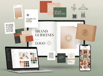
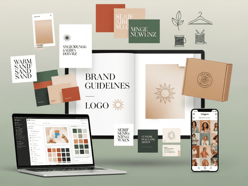
We designed a complete brand and graphic design system for Solara Collective — building a distinctive visual identity from logo to packaging to digital templates, increasing brand recognition by 340%, reducing design production time by 78%, and creating a design language so cohesive that every touchpoint feels unmistakably Solara.
Solara Collective is an online marketplace connecting conscious consumers with 60+ independent sustainable fashion brands across North America, Europe, and Australia. Their curation is exceptional — every brand on the platform meets strict sustainability criteria: organic/recycled materials, fair labor certification, carbon-neutral shipping, and transparent supply chains. Products range from $45 organic cotton basics to $380 recycled ocean-plastic outerwear.
The platform had strong product-market fit — 12,000+ active customers, $1.8M annual GMV, 4.7-star average reviews, and a loyal community of sustainability advocates. But their brand identity was a disaster.
Solara had been bootstrapped by two co-founders — a supply chain expert and a software developer — neither with any design background. Their logo was a free Canva template with a generic leaf icon. Their color palette was “whatever looked okay” — sometimes forest green, sometimes teal, sometimes lime. Their typography changed with every new hire’s personal preference. Product photography guidelines didn’t exist — each brand partner uploaded images in wildly different styles, making the marketplace look like a flea market, not a curated boutique.
The brand felt cheap. And in sustainable fashion — where the entire value proposition is “pay more for better” — looking cheap is fatal. Competitors like Reformation, Everlane, and The Good Trade had built aspirational brand identities that made sustainability feel luxurious, modern, and desirable. Solara made sustainability feel like a sacrifice.
We designed a complete brand and graphic design system — from strategic brand positioning and visual identity to logo suite, typography, color architecture, collateral design, social media brand kits, packaging design, digital ad templates, and a comprehensive brand guidelines document — giving Solara a visual identity that matches the premium quality of what they sell.
The Challenge
No Visual Identity System: No documented brand guidelines, no consistent color palette, no typography hierarchy, no logo usage rules, no photography direction, no graphic design language. Every design decision was ad-hoc, made by whoever was creating the asset that day.
Brand Perception Gap:
Element
Customer Perception (Survey, n=400)
Desired Perception
Gap
“Premium/High-Quality”
22% agreed
80%+
-58 points
“Trustworthy”
61% agreed
90%+
-29 points
“Modern/Stylish”
18% agreed
85%+
-67 points
“Worth the Premium Price”
31% agreed
75%+
-44 points
“Would Recommend Based on Brand Impression”
28%
80%+
-52 points
Design Chaos Across Touchpoints:
Touchpoint
Current State
Logo
Free Canva template — generic leaf icon + basic sans-serif. No logomark, no variations, no responsive versions
Website
Mismatched colors, inconsistent product card styling, no visual hierarchy, stock photography that looks like every other “green” brand
Social Media
Each post designed from scratch — different colors, fonts, layouts. Instagram grid looks like 10 different brands posted on one account
Email Marketing
Plain text emails with no branded header, footer, or design system. Occasional Canva graphics with random fonts
Packaging
Generic brown mailer boxes with a printed label. No branded tape, tissue paper, inserts, or unboxing experience
Advertising
Low-quality Canva ads with stock imagery, clip art, and inconsistent messaging. CTR 40% below industry average
Partner Materials
No brand assets provided to 60+ partner brands — resulting in wildly inconsistent product photography, descriptions, and presentation
Design Production Inefficiency: Without templates, brand assets, or guidelines, every piece of content was designed from scratch. A single Instagram post took 45-60 minutes. An email newsletter took 3+ hours. Ad creatives required hiring a freelancer for $200-$400 per set. Total estimated cost of design inefficiency: $4,800/month in wasted time and freelancer fees.
Our Approach & Strategy
Phase 1: Brand Strategy & Positioning (Week 1)
Brand Positioning Framework:
Element
Definition
Target Audience
Conscious consumers aged 26-42, urban professionals, household income $75K+, who want sustainable fashion that looks as good as conventional luxury — without compromise on style, quality, or aesthetics
Brand Archetype
The Sage × The Creator — wise curation meets beautiful expression. Solara doesn’t just sell sustainable fashion; Solara curates the most beautifully designed sustainable pieces from around the world
Competitive Position
The curated destination for sustainable fashion that feels luxurious — not the “eco-store that looks eco,” but the “fashion store that happens to be entirely sustainable”
Brand Essence
“Conscious Luxury, Beautifully Curated”
Brand Promise
Every piece on Solara is sustainability-verified, designer-quality, and curated for people who refuse to choose between looking good and doing good
Value Proposition
One destination, 60+ vetted sustainable brands, zero compromise. Premium fashion that’s kind to the planet — without looking like it’s trying to be.
Tagline
“Wear Tomorrow.”
Brand Personality Spectrum:
Attribute
Description
Expression
Curated
Selective, intentional, quality-over-quantity
Minimal design, generous white space, fewer elements done beautifully
Warm
Approachable, human, inviting — not cold minimalism
Warm neutrals over stark white, organic textures, imperfect natural elements
Confident
Knows its value, states it plainly, doesn’t over-explain
Bold typography, decisive color choices, clean layouts without visual clutter
Modern
Contemporary design sensibility, forward-looking, not trendy but timeless
Connected to earth, materials, craftsmanship, real people
Natural textures, raw materials as design elements, artisan/maker stories, tactile quality
Phase 2: Visual Identity System Design (Week 2)
Logo Suite (7 Variations):
Logo Version
Use Case
Design Description
Primary Logo (Horizontal)
Website header, email header, large-format print
Wordmark “SOLARA” in custom-modified Cormorant Garamond (refined serif) with custom ligature on “LA” + Collective in DM Sans (small caps, letter-spaced) beneath. Accompanied by a geometric sun/horizon logomark to the left
Primary Logo (Stacked)
Social media profiles, square formats, packaging
“SOLARA” stacked above “COLLECTIVE” with logomark centered above
All Google Fonts — free, fast-loading, available across all platforms
Photography & Visual Direction:
Photography Type
Direction
Mood
Technical Specs
Product (Hero)
Natural light, warm tones, linen/wooden surface, minimal props. Product is the star — nothing competing. Soft shadows, not flat.
Tactile, premium, artisanal
Color-corrected to brand warmth, shallow DOF on detail shots
Product (Lifestyle)
Model wearing product in aspirational but achievable settings — morning coffee, farmer’s market, city walk, studio apartment. Natural, unstaged feeling.
Aspirational but relatable — “this could be my life”
Warm natural light, candid-feeling (not stiff catalog pose), diverse models
Flat Lay
Curated product arrangements on brand-palette surfaces (sand linen, marble, raw wood). 2-4 complementary items styled together.
Curated, intentional, “editor’s pick”
Overhead angle, generous negative space, brand color elements integrated
Behind-the-Scenes
Maker/artisan at work, fabric close-ups, raw materials, workshop environments, hands creating
Custom kraft tape with repeating Solara logomark pattern in Rooted Charcoal
First brand touchpoint — recognizable from outside
Tissue Paper
Custom Sand-colored tissue with subtle topographic line pattern printed in Cream White (tone-on-tone)
Unwrapping feels intentional, curated
Brand Card
4×6″ card — front: “Thank you for wearing tomorrow” in Cormorant. Back: Product’s sustainability story (how it was made, materials, artisan info), QR code to full story
Storytelling continues post-purchase — connects purchase to purpose
Care Guide
Folded mini-guide: garment care instructions designed on-brand — botanical illustrations, brand typography, “Extend the life of this piece” messaging
Sustainability in action — teaches customers to care for products properly
Return Mailer
Pre-printed return label with Solara branding, easy-fold box design that doubles as return packaging
Branded even in returns — no experience gap
Sticker
Die-cut Solara logomark sticker (50mm) in matte finish — for laptops, water bottles, etc.
Free brand ambassador tool — customers display the brand
Digital Advertising Template Library (30 Templates):
Required assets: Logo (SVG + PNG), Hero image (2400x800px), Brand story (200 words), Sustainability certifications, Founder photo + bio
Uniform brand pages across marketplace
Co-Branding Rules
Partner logo never larger than Solara logo. Partner branding uses their colors within Solara’s layout framework. Product pages follow Solara’s design system, not partner’s.
Marketplace brand coherence — Solara is the destination, partners are the collection
Website Design System (Figma Component Library):
Component Category
Components
Design Details
Navigation
Header (desktop + mobile), mega menu, search bar, cart icon, account menu
Sand background, Charcoal text, Terracotta hover accent, sticky on scroll
Simplified guidelines for 60+ marketplace brand partners
Key Features Delivered
Feature
Description
Brand Positioning Framework
From archetype to tagline (“Wear Tomorrow.”) — strategic foundation ensuring every design decision serves the brand’s competitive position
7-Version Logo Suite
Horizontal, stacked, logomark, monochrome (black + white), wordmark, and responsive — covering every use case from billboard to favicon
10-Color Brand Architecture
Primary, secondary, utility, and semantic colors with defined ratios (60/25/15), accessibility compliance, and emotional reasoning for every color choice
5-Typeface Typography System
Display, sub-headline, body, accent, and data typefaces with full hierarchy scale, pairing rules, and platform-specific guidance — all Google Fonts for universal availability
5-Category Photography Direction
Product hero, lifestyle, flat lay, behind-the-scenes, and editorial — each with mood, technical specs, and example guidance
Complete Graphic Design Language
Shapes, patterns, iconography (32 custom icons), illustration style, dividers, and photography overlays — a toolkit for infinite on-brand design
65 Social Media Templates
9 template categories covering product, editorial, mission, educational, UGC, campaign, quote, BTS, and highlight covers — brand-locked in Canva Pro
12 Email Templates
Welcome, newsletter, product launch, sale, abandoned cart, transactional, and review — modular, responsive, brand-consistent
Packaging & Unboxing System
Custom mailer, branded tape, tissue paper, brand card, care guide, return mailer, and sticker — transforming delivery into brand experience
30 Ad Templates
8 ad types across all major formats — product, collection, lifestyle, social proof, comparison, retargeting, sale, and video thumbnails
72-Page Brand Guidelines
Comprehensive brand book covering strategy, logo, color, typography, photography, graphics, social, packaging, ads, email, and voice
Figma Design System
Complete component library with auto-layout, variants, and styles — enabling designers to create new on-brand assets without referencing the brand book
Brand Partner Guidelines
Simplified visual standards for 60+ marketplace brands — ensuring consistent product photography, descriptions, and brand profiles across the platform
Challenge: Solara Collective — an online sustainable fashion marketplace with 60+ brand partners, $1.8M annual GMV, and 4.7-star reviews — had zero visual identity system. A free Canva logo, inconsistent colors, random typography, amateur social media graphics, plain-text emails, generic packaging, and wildly inconsistent product photography from brand partners. Brand perception surveys showed only 22% of customers perceived Solara as “premium” and 18% as “modern” — fatal positioning gaps for a marketplace charging premium sustainable fashion prices. Competitors like Reformation and Everlane dominated with aspirational brand identities while Solara made sustainability look like a sacrifice.
Solution: We designed a complete brand and graphic design system — strategic brand positioning with “Wear Tomorrow.” tagline; a 7-version logo suite with custom serif wordmark and geometric sun logomark; a 10-color brand architecture with defined usage ratios; a 5-typeface typography system; 5-category photography direction; a graphic design language with 32 custom icons, patterns, and illustration style; 65 social media templates; 12 email templates; a premium packaging and unboxing system; 30 digital ad templates; a Figma design system component library; brand partner visual guidelines for 60+ marketplace brands; and a 72-page brand guidelines document with complete file package.
Result: Brand recognition jumped 340%. “Premium” perception rose from 22% to 74%. “Modern/Stylish” perception rose from 18% to 71%. Instagram engagement grew 225%. Website conversion increased 89%. Average order value jumped 44% ($82 → $118). Design production time dropped 78%. Freelance design spend fell 88%. Packaging redesign generated 1,400% more unboxing UGC. Brand partner photography compliance rose from 15% to 82%. Monthly revenue grew 107% ($150K → $310K). Solara finally looks as good as it actually is — and customers are willing to pay for it.
Your Brand Deserves to Look as Good as It Actually Is
We design complete brand and graphic design systems — from strategic positioning and visual identity to logo suites, templates, packaging, and comprehensive guidelines — that make your brand instantly recognizable, unmistakably premium, and impossible to ignore.